Chapter 3 Word Frequency
To understand how students evaluate professors, we can first investigate what words are used in describing a professor. This can be done by finding the most commonly used words in the narrative comments.
We use the cleaned, stemmed data in the analysis. We name the dataset prof1000 in R.
prof1000 <- read.csv("data/prof1000.stem.gender.csv", stringsAsFactors = FALSE)
str(prof1000)
## 'data.frame':    38157 obs. of  14 variables:
##  $ id           : int  1 2 3 4 5 6 7 8 9 10 ...
##  $ profid       : int  1 1 1 1 1 1 1 1 1 1 ...
##  $ rating       : num  5 5 4 3 1 5 5 2 3 3 ...
##  $ difficulty   : int  3 4 5 5 5 5 5 4 5 5 ...
##  $ credit       : int  1 1 1 1 1 1 1 1 1 1 ...
##  $ grade        : int  5 4 5 7 3 NA 6 7 7 8 ...
##  $ book         : int  0 0 0 0 0 1 1 1 1 1 ...
##  $ take         : int  1 1 1 0 0 0 1 0 NA NA ...
##  $ attendance   : int  1 1 0 1 1 1 1 1 1 0 ...
##  $ tags         : chr  "respected;accessible outside class;skip class? you won't pass." "accessible outside class;lots of homework;respected" "tough grader;lots of homework;accessible outside class" "tough grader;so many papers;lots of homework" ...
##  $ comments     : chr  "best professor I've had in college. only thing i dont like is the writing assignment" "Professor has been the best mathematics professor I've had at thus far. He assign a heavy amount of homework bu"| __truncated__ "He was a great professor. he does give a lot of homework but he will work with you if you don't clear understan"| __truncated__ "Professor is an incredible respected teacher, however his class is extreme difficult. I believe he just assume "| __truncated__ ...
##  $ date         : chr  "04/17/2018" "02/13/2018" "01/07/2018" "12/11/2017" ...
##  $ gender       : chr  "M" "M" "M" "M" ...
##  $ gender.degree: int  1 1 1 1 1 1 1 1 1 1 ...
We then divide the comments on the professors into individual words using the function unnest_tokens from the R package tidytext. We call the dataset prof.tm.
prof.tm <- unnest_tokens(prof1000, word, comments)

dim(prof.tm)
## [1] 1668696      14

head(prof.tm)
##     id profid rating difficulty credit grade book take attendance
## 1    1      1      5          3      1     5    0    1          1
## 1.1  1      1      5          3      1     5    0    1          1
## 1.2  1      1      5          3      1     5    0    1          1
## 1.3  1      1      5          3      1     5    0    1          1
## 1.4  1      1      5          3      1     5    0    1          1
## 1.5  1      1      5          3      1     5    0    1          1
##                                                               tags       date
## 1   respected;accessible outside class;skip class? you won't pass. 04/17/2018
## 1.1 respected;accessible outside class;skip class? you won't pass. 04/17/2018
## 1.2 respected;accessible outside class;skip class? you won't pass. 04/17/2018
## 1.3 respected;accessible outside class;skip class? you won't pass. 04/17/2018
## 1.4 respected;accessible outside class;skip class? you won't pass. 04/17/2018
## 1.5 respected;accessible outside class;skip class? you won't pass. 04/17/2018
##     gender gender.degree      word
## 1        M             1      best
## 1.1      M             1 professor
## 1.2      M             1      i've
## 1.3      M             1       had
## 1.4      M             1        in
## 1.5      M             1   college
After that, we have a total of 1668696 individual words from the 38157 comments on the 1,000 professors.
We now get the frequency of each word using the count function. We also sort the words from most frequent to least frequent.
word.freq <- prof.tm %>% count(word, sort = TRUE)
word.freq
## # A tibble: 8,573 x 2
##    word      n
##    <chr> <int>
##  1 the   57819
##  2 and   56385
##  3 is    47442
##  4 to    46767
##  5 a     43134
##  6 you   41043
##  7 class 36789
##  8 he    34357
##  9 i     29713
## 10 she   25081
## # ... with 8,563 more rows
3.1 Stopwords
From the output, a total of 8573 unique words were used in the 38157 comments. The words with the highest frequency are “the”, “and”, “is”, and so on. Although those words are extremely common, they do not provide much useful information for analysis because they are commonly used in all contexts. Therefore, we often simply remove these words before any analysis.
Tidytext includes a dataset called stop_words which consists of words from three systems.
- SMART: This stopword list was built by Gerard Salton and Chris Buckley for the SMART information retrieval system at Cornell University. It consists of 571 words.
- snowball: The snowball list is from the string processing language snowball. It has 174 words.
- onix: This stopword list is probably the most widely used stopword list. It is from the onix system. This wordlist contains 429 words.
stop_words
## # A tibble: 1,149 x 2
##    word        lexicon
##    <chr>       <chr>
##  1 a           SMART
##  2 a's         SMART
##  3 able        SMART
##  4 about       SMART
##  5 above       SMART
##  6 according   SMART
##  7 accordingly SMART
##  8 across      SMART
##  9 actually    SMART
## 10 after       SMART
## # ... with 1,139 more rows
The combination of the three lists, a total of 1,149 words (some are the same words), might be too aggressive. Particularly, the list was not developed for teaching evaluation. For example, the SMART list would remove the word least. But in many comments, it is very useful for teaching evaluation. For example, in one comment, it said, This is the least organized professor. Similarly, the onix list suggests removing best, which we think should be kept. Therefore, we went through the 1,149 words and identified a total of 568 words that can be safely removed. There are also words such as “professor”, “teacher”, and “Dr.” that are not in the three stopwords list. However, they are very commonly used in teaching evaluation and should be removed when necessary. The list of words is saved in the file stopwords.evaluation.csv. It has two types of words - “evaluation” and “optional”.
stopwords <- read_csv("data/stopwords.evaluation.csv")
stopwords
## # A tibble: 619 x 2
##    word        lexicon
##    <chr>       <chr>
##  1 a           evaluation
##  2 a's         evaluation
##  3 able        evaluation
##  4 about       evaluation
##  5 according   evaluation
##  6 accordingly evaluation
##  7 across      evaluation
##  8 actually    evaluation
##  9 after       evaluation
## 10 afterwards  evaluation
## # ... with 609 more rows
The function read_csv is similar to read.csv but creates a tibble data set instead of the typical data frame.
To remove the stopwords, we can use the function anti_join. We first remove the “evaluation” words. We use the filter function to select the subset of words.
prof.tm <- prof.tm %>% anti_join(filter(stopwords, lexicon == "evaluation"))

prof.tm %>% count(word, sort = TRUE) %>% print(n = 20)
## # A tibble: 8,191 x 2
##    word          n
##    <chr>     <int>
##  1 class     36789
##  2 not       18103
##  3 very      16626
##  4 professor 10685
##  5 test      10548
##  6 teacher   10276
##  7 easy      10033
##  8 great      7944
##  9 lecture    7709
## 10 good       7103
## 11 hard       6913
## 12 student    6863
## 13 help       6295
## 14 lot        6031
## 15 work       5805
## 16 time       5512
## 17 learn      5476
## 18 like       5191
## 19 exam       4887
## 20 know       4886
## # ... with 8,171 more rows
After removing the common stopwords, we have a total of 8,191 unique words left. We can also see that the most frequent words are “class”, “not”, “very”, “professor”, “teacher”, etc. Clearly, some of these words are not very helpful to analyze in many situations. We have included those words in our optional stopwords list. Therefore, we further remove those words.
prof.tm <- prof.tm %>% anti_join(filter(stopwords, lexicon == "optional"))

word.freq <- prof.tm %>% count(word, sort = TRUE)
word.freq
## # A tibble: 8,155 x 2
##    word        n
##    <chr>   <int>
##  1 test    10548
##  2 easy    10033
##  3 great    7944
##  4 lecture  7709
##  5 good     7103
##  6 hard     6913
##  7 help     6295
##  8 work     5805
##  9 time     5512
## 10 learn    5476
## # ... with 8,145 more rows
3.2 Visualization of word frequency
We can visualize the frequency of the words using different methods.
3.2.1 Barplot
We can plot the frequency of the words using a barplot in which the length of the bars representing the frequencies of the words. For example, Figure 3.1 shows the top 20 most frequently used words. In the figure, we flipped the coordinates to put the words on the y-axis using the option coord_flip.
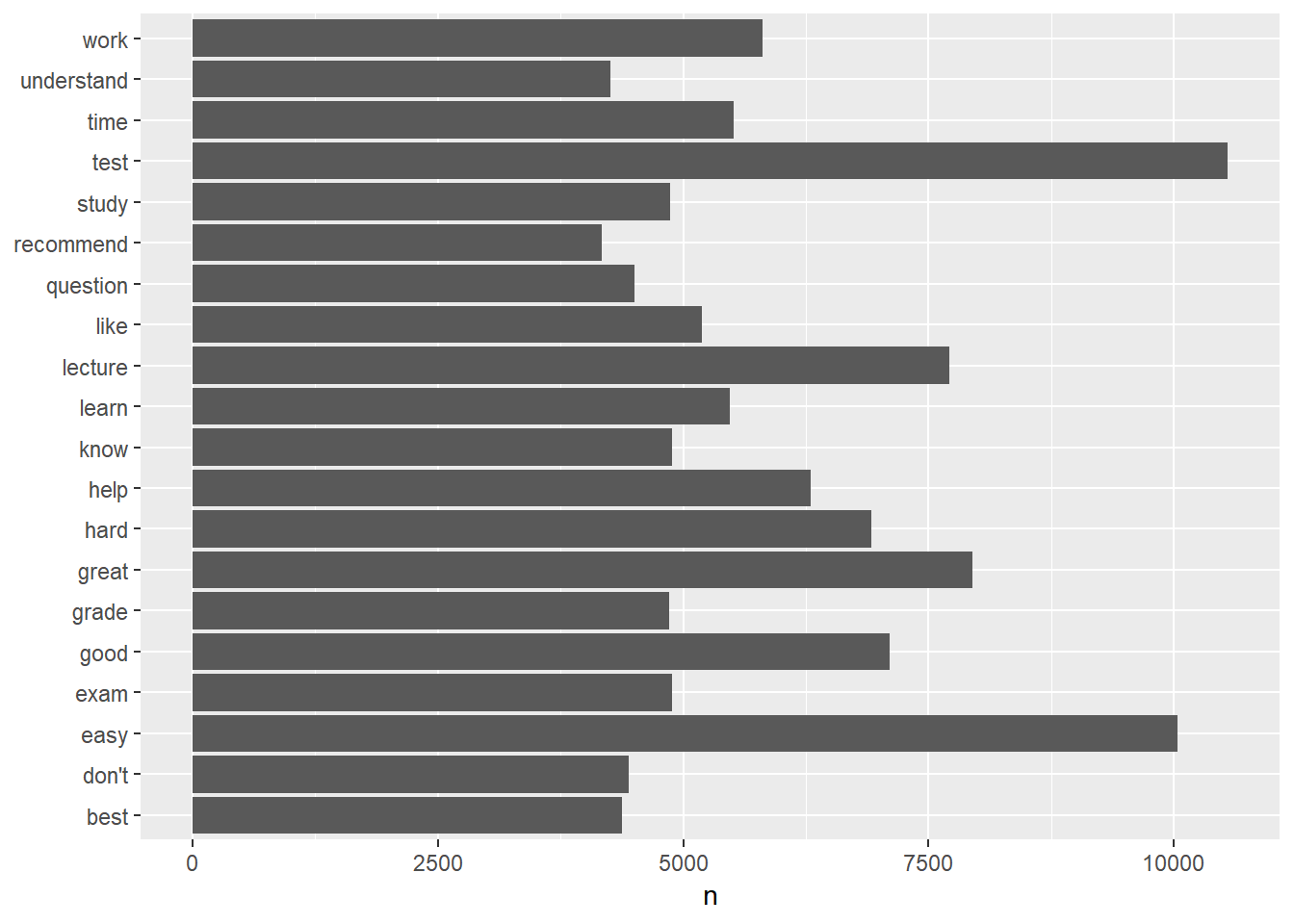
Figure 3.1: Barplot of word frequency
Note that the words were ordered in the alphabetical order. We can also order the words based their frequency. In doing so, we convert the word variable from a character variable to a factor and then plot it in Figure 3.2. The function reorder treats word as a categorical variable, and reorders individual words as its levels based on the word frequency n.
word.freq %>% top_n(20) %>% mutate(word = reorder(word, n)) %>% ggplot(aes(word,
    n)) + geom_col() + xlab(NULL) + coord_flip()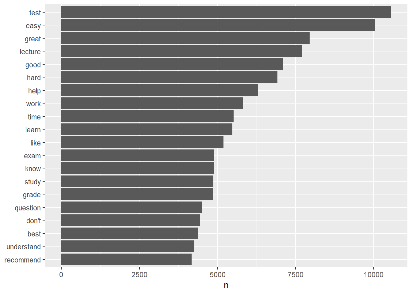
Figure 3.2: Barplot of word frequency
3.2.2 Word cloud (wordcloud)
Another way to visualize the word frequency is to generate a word cloud. A word cloud directly plots the words in a figure with the size of the words representing the frequency of them. A word cloud can be generated using the R package wordcloud.
The package cannot be directly used in the “pipe” way. However, we can use with function together with it. For example, the code below generates a word cloud in Figure ?? for the top 50 words.
library(wordcloud)
word.freq %>% with(wordcloud(word, n, max.words = 50, random.order = FALSE, rot.per = 0.35,
    colors = brewer.pal(8, "Dark2")))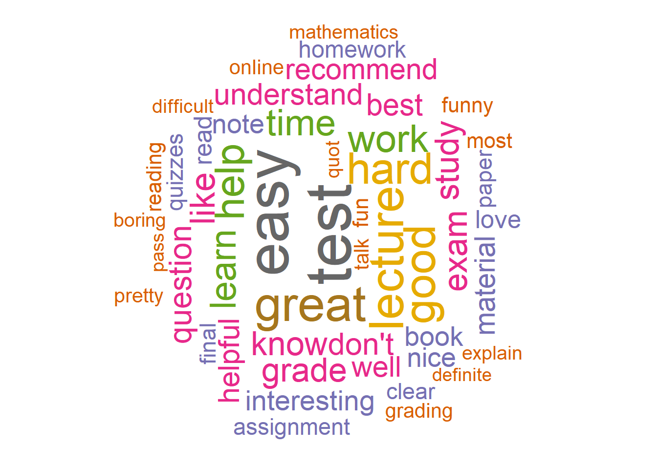
Figure 3.3: Wordclouds of word frequency
The R function wordcloud needs at least a variable with the list words and another variable with the word frequency. The other useful options include
-
max.words: Maximum number of words to be plotted and the least frequent terms are not plotted. -
random.order: Plot words in random order; otherwise they will be plotted in decreasing frequency. In general, it is better to set this asFALSE. -
rot.per: Proportion words with 90-degree rotation. -
colors: Color words from least to most frequent.brewer.palmakes the color palettes from The R packageColorBreweravailable as R palettes. The paletteDark2seems to work best for a word cloud.
Another package that can be used to generate a word cloud is wordcloud2. It is developed based on wordcloud but provides some other useful features. It is particularly useful to show the plot in a webpage because it interactively shows the word frequency.
3.3 n-gram analysis
Compared to a single word, a group of words can be more informative. For example, see the comment below. It starts with not easy. If the comment was broken into individual words and look at “easy” only, the meaning is the opposite.
not easy at all, yes she is good teacher and explaine material well enough. BUT there is a LOT of material and you never know what paricularly would be on test. she ask on test not much but in details. be ready to read and memorise a huge amount of information
Instead of splitting a comment to single words, we can divide them into groups, e.g., two words, three words or more. In this way, we can capture some information that cannot be reflected in individual words. The method that breaks words into groups is in general called “n-gram” analysis. With two words, it’s 2-gram or bigram analysis and with three it’s called 3-gram or trigram analysis.
The tidytext package can also be used to split documents or comments into multiple words.
3.3.1 2-gram analysis
The following code will split the comments on the professors into two consecutive words. Note that we set token="ngrams" and then n=2 for two words.
prof.tm <- unnest_tokens(prof1000, word, comments, token = "ngrams", n = 2)

head(prof.tm[, c("id", "word")])
##   id           word
## 1  1 best professor
## 2  1 professor i've
## 3  1       i've had
## 4  1         had in
## 5  1     in college
## 6  1   college only
Each two-word phase can be viewed as an individual word for word frequency analysis as in the single-word situation.
prof.tm %>% count(word, sort = TRUE)
## # A tibble: 211,498 x 2
##    word           n
##    <chr>      <int>
##  1 he is      11810
##  2 if you     10810
##  3 is a        7698
##  4 she is      6458
##  5 the class   5921
##  6 of the      5357
##  7 this class  5075
##  8 a lot       4897
##  9 is very     4182
## 10 it is       3802
## # ... with 211,488 more rows
As for the single word, the extremely common phrases such as “he is” and “if you” might not be very informative in teaching evaluation analysis. We can remove those frequent terms first. To do so, we first split the two-word phrases into single words and remove stopwords as we did earlier.
prof.separated <- prof.tm %>% separate(word, c("word1", "word2"), sep = " ") %>%
    anti_join(filter(stopwords, lexicon == "evaluation"), by = c(word1 = "word")) %>%
    anti_join(filter(stopwords, lexicon == "evaluation"), by = c(word2 = "word"))

head(prof.separated[, c("id", "word1", "word2")])
##   id       word1       word2
## 1  1        best   professor
## 2  1     college        only
## 3  1        dont        like
## 4  1     writing  assignment
## 5  2        best mathematics
## 6  2 mathematics   professor
Then we can check the frequency of them. Before counting the frequency, we connect the two words together using the function unite.
prof.count <- prof.separated %>% unite(word, word1, word2, sep = " ") %>% count(word,
    sort = TRUE)

prof.count
## # A tibble: 67,216 x 2
##    word                 n
##    <chr>            <int>
##  1 great teacher     1837
##  2 very helpful      1671
##  3 extra credit      1509
##  4 great professor   1358
##  5 highly recommend  1290
##  6 pay attention     1098
##  7 good teacher      1064
##  8 study guide       1009
##  9 best professor    1007
## 10 very nice          970
## # ... with 67,206 more rows
From the output, we can see the most widely used pair of words is “great teacher” after removing the stopwords. Note that as in stemming words, we can also combine some 2-grams such as “great teacher”, “great professor” and “best professor” into one 2-gram.
We now visualize the information using both bar plot and word clouds.
## plot the frequency
prof.count %>% top_n(30) %>% mutate(word = reorder(word, n)) %>% ggplot(aes(word,
    n)) + geom_col() + xlab(NULL) + coord_flip()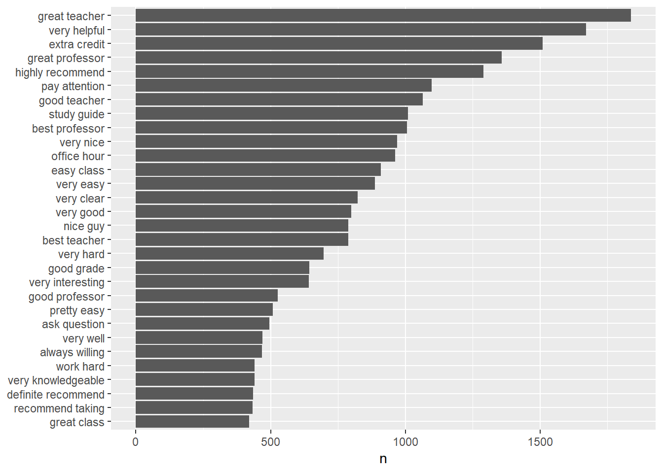
## create a wordcloud
prof.count %>% with(wordcloud(word, n, scale = c(2, 0.5), max.words = 50, random.order = FALSE,
    rot.per = 0.35, colors = brewer.pal(8, "Dark2")))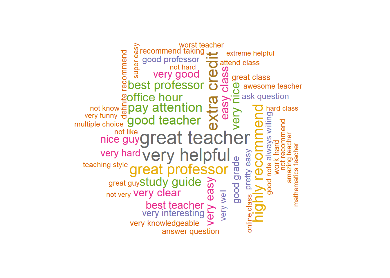
3.3.1.1 Network plot of the word relationship
With n-grams, we can connect words together in a graph to form a network plot. This is another way to visualize 2-grams and the word relationship. The R package ggraph can be used to generate such a network plot. To use the package, we have to first create an igraph graph using the igraph package. This can be done easily using the graph_from_data_frame() function from the igraph package as shown in the code below.
Note that in the R code, we used the data set with the separated words after removing stopwords. For better presentation, we also select the pairs of words with at least 300 occurrences. The generated igraph graph is called word.network. It has 58 words and 56 connections among them.
library(igraph)

word.network <- prof.separated %>% count(word1, word2, sort = TRUE) %>% filter(n >
    300) %>% graph_from_data_frame()

word.network
## IGRAPH 3e6b346 DN-- 58 56 --
## + attr: name (v/c), n (e/n)
## + edges from 3e6b346 (vertex names):
##  [1] great ->teacher       very  ->helpful       extra ->credit
##  [4] great ->professor     highly->recommend     pay   ->attention
##  [7] good  ->teacher       study ->guide         best  ->professor
## [10] very  ->nice          office->hour          easy  ->class
## [13] very  ->easy          very  ->clear         very  ->good
## [16] nice  ->guy           best  ->teacher       very  ->hard
## [19] good  ->grade         very  ->interesting   good  ->professor
## [22] pretty->easy          ask   ->question      very  ->well
## + ... omitted several edges
An igraph graph includes a lot of information.
The first line of the output includes the following information.
- A unique identifier of the graph - here it is “42e299e”.
-
Following the name is the indicator of the type of graph. Different letters can be used to denote the type - “U or D”, “N”, “W”, and “B” in the presented order.
- First letter: “U” for undirected and “D” for directed graphs.
- Second letter: “N” for a named graph.
- Third letter: “W” for weighted graphs.
- Fourth letter: “B” for bipartite graphs.
- Two numbers: the number of vertices (words in this example) and the number of edges (the connection between words) in the graph.
The second line contains all the attributes of the graph. It is either about the vertices (nodes, actors) identified by the first letter “v” in the parenthesis or the edges (paths, links) identified by the first letter “e” in the parenthesis. For example, this graph has a “name” graph attribute, of type character (identified by the second letter“c” after “/”). The “name” attribute include the information on the individual words. It also has a graph attribute called “n” for the edges. It consists of the frequency information of the words. Many attributes can be used here but an attribute is not required.
Starting on the third line, it includes the information on the edges. For a given edge, it has the starting vertice, the direction, and the end vertice.
With the igraph graph representation, we can now generate a network plot using the R package ggraph, which uses the same plotting method as ggplot2. Particularly the following code can be used. From the plot, we can easily see how the words are related to each other. For example, the words “not”, “very”, and “teacher” are connected to many other words.
library(ggraph)
set.seed(20181005)

a <- arrow(angle = 30, length = unit(0.1, "inches"), ends = "last", type = "open")

ggraph(word.network, layout = "fr") + geom_edge_link(aes(color = n, width = n), arrow = a) +
    geom_node_point() + geom_node_text(aes(label = name), vjust = 1, hjust = 1)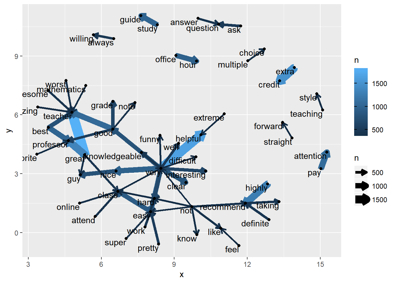
3.3.2 3-grams
As for 2-gram analysis, we can conduct an analysis using three words. The following code does the analysis and generates a bar plot and a word cloud.
prof.tm <- unnest_tokens(prof1000, word, comments, token = "ngrams", n = 3)

prof.separated <- prof.tm %>% separate(word, c("word1", "word2", "word3"), sep = " ") %>%
    anti_join(filter(stopwords, lexicon == "evaluation"), by = c(word1 = "word")) %>%
    anti_join(filter(stopwords, lexicon == "evaluation"), by = c(word2 = "word")) %>%
    anti_join(filter(stopwords, lexicon == "evaluation"), by = c(word3 = "word"))

prof.count <- prof.separated %>% count(word1, word2, word3, sort = TRUE) %>% unite(word,
    word1, word2, word3, sep = " ")

## plot the frequency
prof.count %>% filter(n > 50) %>% mutate(word = reorder(word, n)) %>% ggplot(aes(word,
    n)) + geom_col() + xlab(NULL) + coord_flip()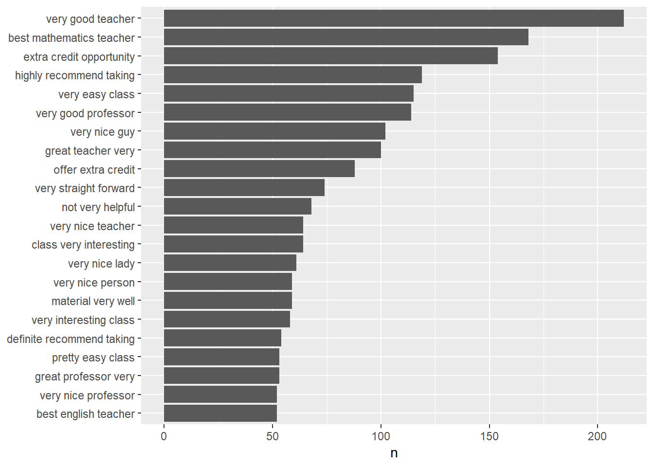
## create a wordcloud
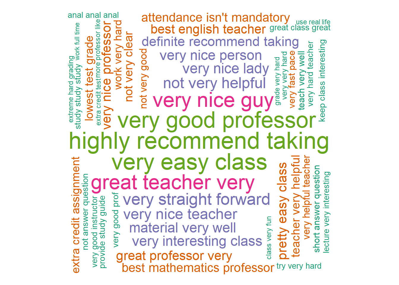
prof.count %>% with(wordcloud(word, n, max.words = 200, random.order = FALSE, rot.per = 0.35,
    colors = brewer.pal(8, "Dark2")))