Chapter 9 Data Visualization
9.1 Data
ACTIVE (Advanced Cognitive Training for Independent and Vital Elderly), 1999-2001 [United States] was a multisite randomized controlled trial conducted at six field sites with New England Research Institutes (NERI) as the coordinating center. The field sites included the University of Alabama at Birmingham, Hebrew Rehabilitation Center for the Aged in Boston, Indiana University, Johns Hopkins University in Baltimore, Pennsylvania State University, and the University of Florida/Wayne State University (Detroit). The primary aim of the trial was to test the effects of three distinct cognitive interventions – previously found to be successful in improving elders’ performance on basic measures of cognition under laboratory or small-scale field conditions – on measures of cognitively demanding daily activities. Trainings consisted of an initial series of ten group sessions followed by four-session booster trainings at one and three years. The three cognitive interventions focused on memory, executive reasoning, and speed of processing. The design included a no-contact control group. Participants were assessed at baseline, immediately after training, and annually thereafter. A total of 2,832 older adults were enrolled in the trial, and 2,802 were included in the analytical sample. Twenty-six percent of the participants were African American.
There are 13 variables in the data set active.csv.
- site: a total of 6 sites
- age
- edu: years of education
- group: there are four groups - a control group and three other training groups (memory, reasoning, and speed)
- booster: whether received booster training
- sex: 1 Male 2 Female
- reason: reasoning ability
- ufov: useful field of view variable
- hvltt: Hopkins Verbal Learning Test total score at time 1
- hvltt2: Hopkins Verbal Learning Test total score at time 2
- hvltt3: Hopkins Verbal Learning Test total score at time 3
- hvltt4: Hopkins Verbal Learning Test total score at time 4
- mmse: Mini-mental state examination total score
active <- read.csv('data/active.csv')
str(active)
## 'data.frame':    1575 obs. of  14 variables:
##  $ site   : int  1 1 6 5 4 1 4 6 6 5 ...
##  $ age    : int  76 67 67 72 69 70 77 79 73 78 ...
##  $ edu    : int  12 10 13 16 12 13 13 12 13 13 ...
##  $ group  : int  1 1 3 1 4 1 1 4 4 4 ...
##  $ booster: int  1 1 1 1 0 1 1 0 0 0 ...
##  $ sex    : int  1 2 2 2 2 1 2 2 2 2 ...
##  $ reason : int  28 13 24 33 30 35 32 38 17 14 ...
##  $ ufov   : int  16 20 16 16 16 23 23 20 16 26 ...
##  $ hvltt  : int  28 24 24 35 35 29 18 25 24 22 ...
##  $ hvltt2 : int  28 22 24 34 29 27 16 26 17 19 ...
##  $ hvltt3 : int  17 20 28 32 34 26 27 25 20 21 ...
##  $ hvltt4 : int  22 27 27 34 34 29 30 29 11 26 ...
##  $ mmse   : int  27 25 27 30 28 23 26 30 26 27 ...
##  $ id     : int  1 2 3 4 5 6 7 8 9 10 ...
9.2 Data visualization using base R functions
R is very well known for its ability in visualizing data. R base already provides many useful functions for plotting data.
For example, to get a scatterplot, we can use the plot function.
attach(active)
plot(x = hvltt, y = reason)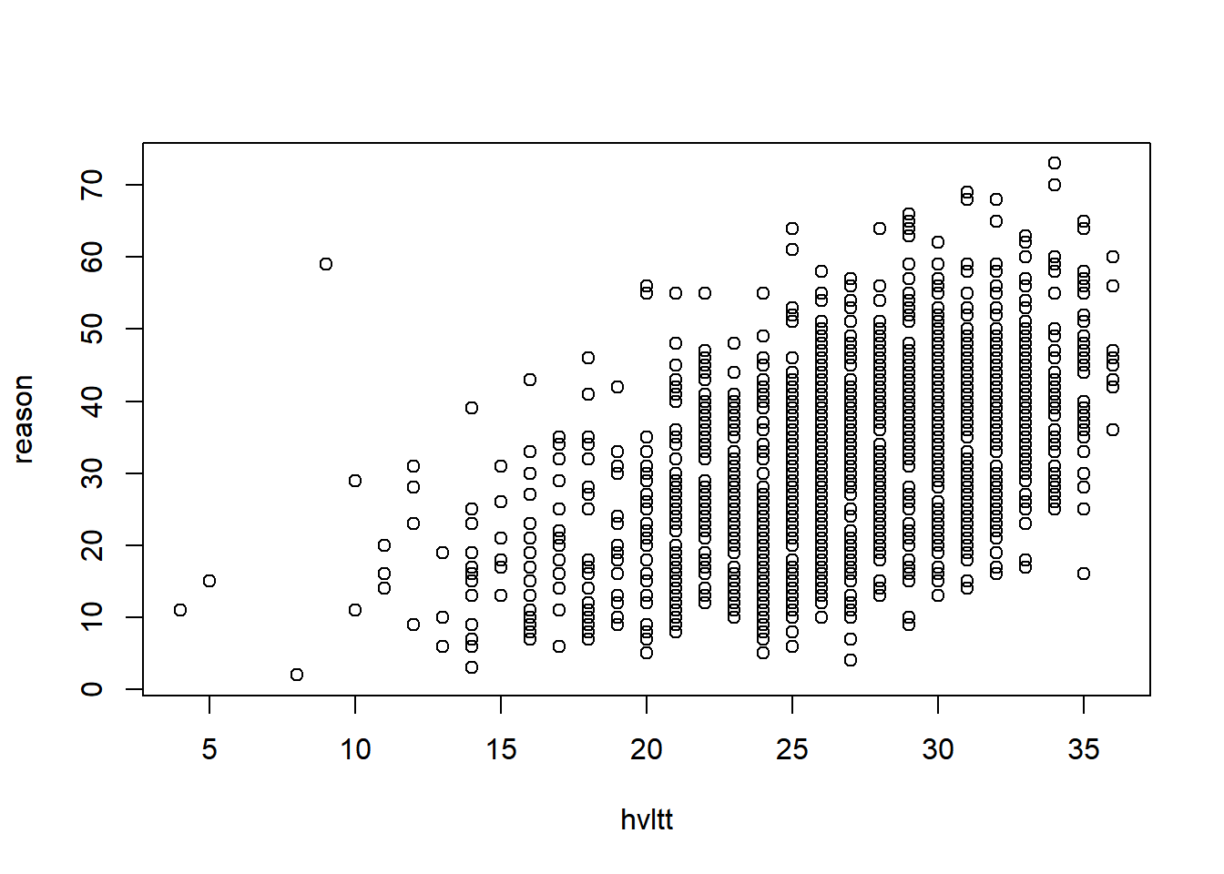
Each point represents a pair of data from a subject. If two subjects have the same data, the points will overlap and become one. To see where the data are clustered, we can add a small noise to the data. jitter function is used here and the option factor specifies how much noise to add.
plot(x = jitter(hvltt, factor=10), y = reason)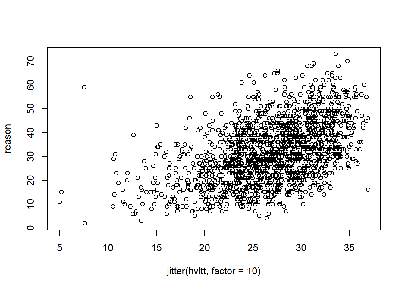
We can change the labels for x-axis and y-axis.
plot(x = jitter(hvltt, factor=2), y = reason,
     xlab="Verbal ability", ylab="Reasoning ability")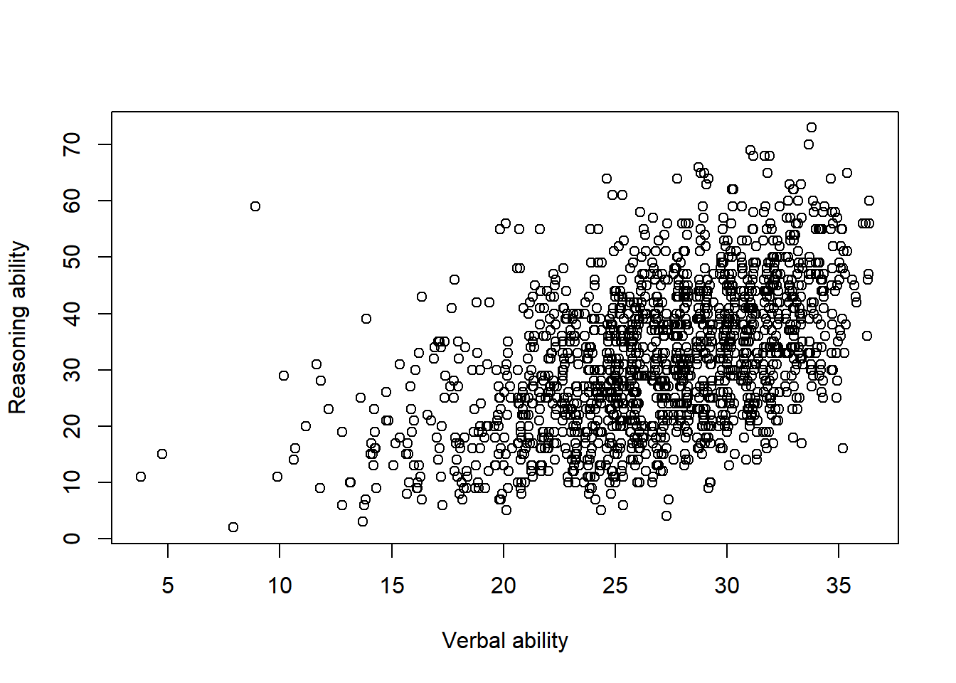
A title can be added.
plot(x = jitter(hvltt, factor = 2), y = reason,
     xlab = "Verbal ability", ylab = "Reasoning ability",
     main = "Relationship between verbal and reasoning ability")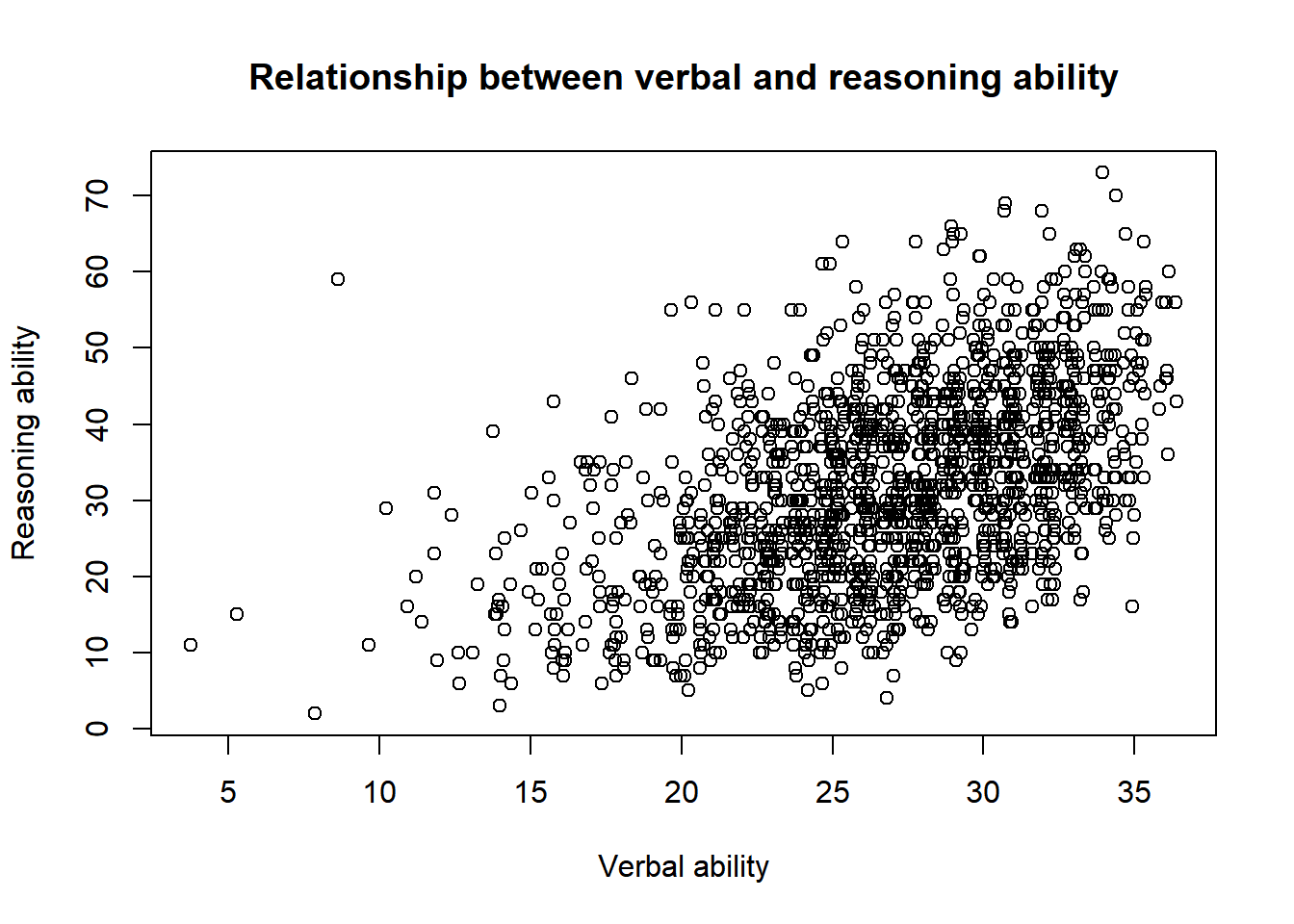
9.2.1 Save a plot
Different ways can be used to save a figure. One is to plot it first and save it to the computer. The other way is to directly plot to a file. The most common file formats include pdf, svg, png, and jpeg.
For example, to generate a pdf plot, we can use:
pdf('data/active.pdf')
plot(x = jitter(hvltt, factor = 2), y = reason,
     xlab = "Verbal ability", ylab = "Reasoning ability",
     main = "Relationship between verbal and reasoning ability")
dev.off()
## png
##   2

jpeg('data/active.jpg')
plot(x = jitter(hvltt, factor = 2), y = reason,
     xlab = "Verbal ability", ylab = "Reasoning ability",
     main = "Relationship between verbal and reasoning ability")
dev.off()
## png
##   2
The function pdf() opens a pdf file/device for plotting. Then, any plot process used in R can be applied after. At the end of the plot, one closes the file/device using the function dev.off().
For other types of plot, the same procedure can be followed. For example, svg() is for svg plot, png() for PNG plot, jpeg() for jpg plot, bmp() for bmp plot.
9.2.2 More complex plots
The ACTIVE data can be grouped into male and female participants. Suppose we want to visualize the two groups of data.
One way to do it is to generate two plots. The two plots can also be put together into one figure. Note that the function par is used to specify the plot parameters. Particularly, we use mfrow to set the layout of the two plots as one row with two columns.
par(mfrow=c(nr=1,nc=2))
plot(x = jitter(hvltt[sex==1], factor = 2), y = reason[sex==1],
     xlab = "Verbal ability", ylab = "Reasoning ability",
     main = "For Male")

plot(x = jitter(hvltt[sex==2], factor = 2), y = reason[sex==2],
     xlab = "Verbal ability", ylab = "Reasoning ability",
     main = "For Female")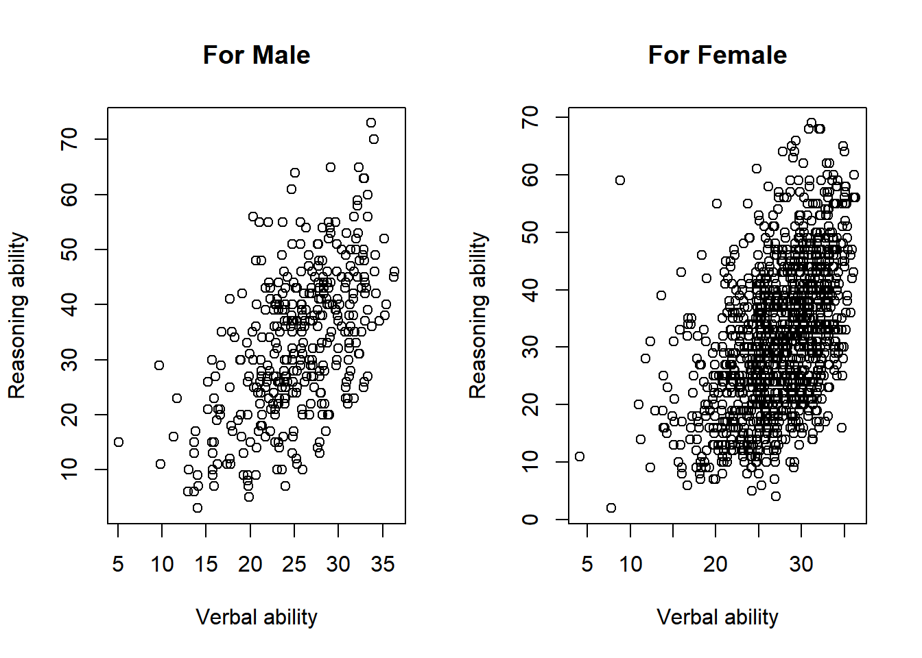
par(mfrow=c(1,1))The function layout provides more control of the layout of multiple figures. It uses a matrix to tell the location of the figure. In the matrix, each number from 1 to K to indicate plot 1 to plot K. Zero (0) can be used to skip a figure.
layout <- layout(matrix(c(1,2), 1, 2, byrow = TRUE))
layout.show(layout)

layout <- layout(matrix(c(1,1,0,2), 2, 2, byrow = TRUE))
layout.show(layout)
layout <- layout(matrix(c(1,1,2,3), 2, 2, byrow = TRUE))
layout.show(layout)
layout <- layout(matrix(c(1,2,3,4), 2, 2, byrow = TRUE),
                 widths=c(1,3), heights=c(3,1))
layout.show(layout)
layout <- layout(matrix(c(1,2,3,3), 2, 2, byrow = TRUE),
                 widths=c(1,3), heights=c(3,1))
layout.show(layout)
Now the active data
layout <- layout(matrix(c(1,1,2,3), 2, 2, byrow = TRUE),
                 widths=c(1,1), heights=c(2,1))

plot(x = jitter(hvltt, factor = 2), y = reason,
     xlab = "Verbal ability", ylab = "Reasoning ability",
     main = "Overall")

plot(x = jitter(hvltt[sex==1], factor = 2), y = reason[sex==1],
     xlab = "Verbal ability", ylab = "Reasoning ability",
     main = "For Male")

plot(x = jitter(hvltt[sex==2], factor = 2), y = reason[sex==2],
     xlab = "Verbal ability", ylab = "Reasoning ability",
     main = "For Female")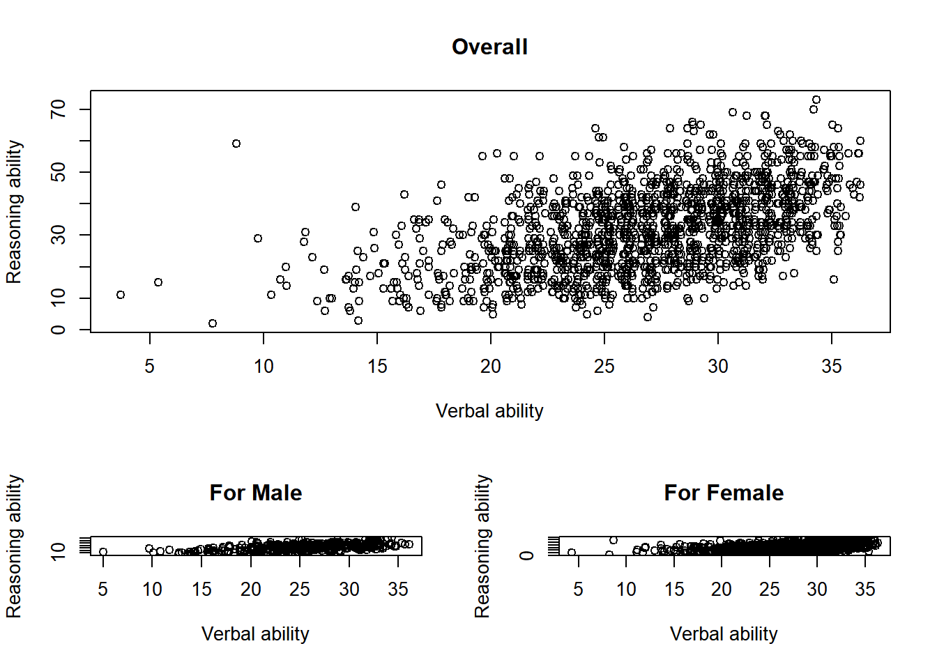
Practice
layout <- layout(matrix(c(1,2,3,4), 2, 2, byrow = TRUE))

plot(x = jitter(hvltt[group==1], factor = 2), y = reason[group==1],
     xlab = "Verbal ability", ylab = "Reasoning ability",
     main = "For Male")

plot(x = jitter(hvltt[group==2], factor = 2), y = reason[group==2],
     xlab = "Verbal ability", ylab = "Reasoning ability",
     main = "For Female")

plot(x = jitter(hvltt[group==3], factor = 2), y = reason[group==3],
     xlab = "Verbal ability", ylab = "Reasoning ability",
     main = "For Male")

plot(x = jitter(hvltt[group==4], factor = 2), y = reason[group==4],
     xlab = "Verbal ability", ylab = "Reasoning ability",
     main = "For Female")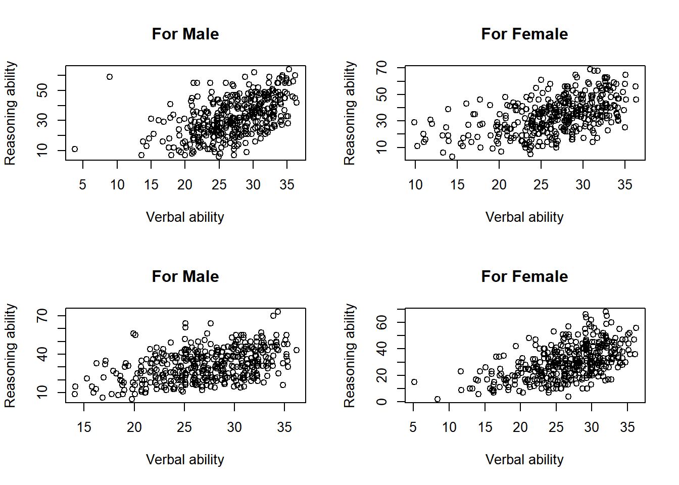
Another way to visualize the same data is to plot them in the same plot.
par(mfrow=c(1,1))
plot(x = jitter(hvltt[sex==1], factor = 2), y = reason[sex==1],
     xlab = "Verbal ability", ylab = "Reasoning ability",
     xlim=c(0, max(hvltt)), ylim=c(0, max(reason)), col='red', pch=1)

points(x = jitter(hvltt[sex==2], factor = 2), y = reason[sex==2],
       col='blue', pch=2)

legend('topleft', c('Male', 'Female'), col=c('red','blue'), pch = c(1,2))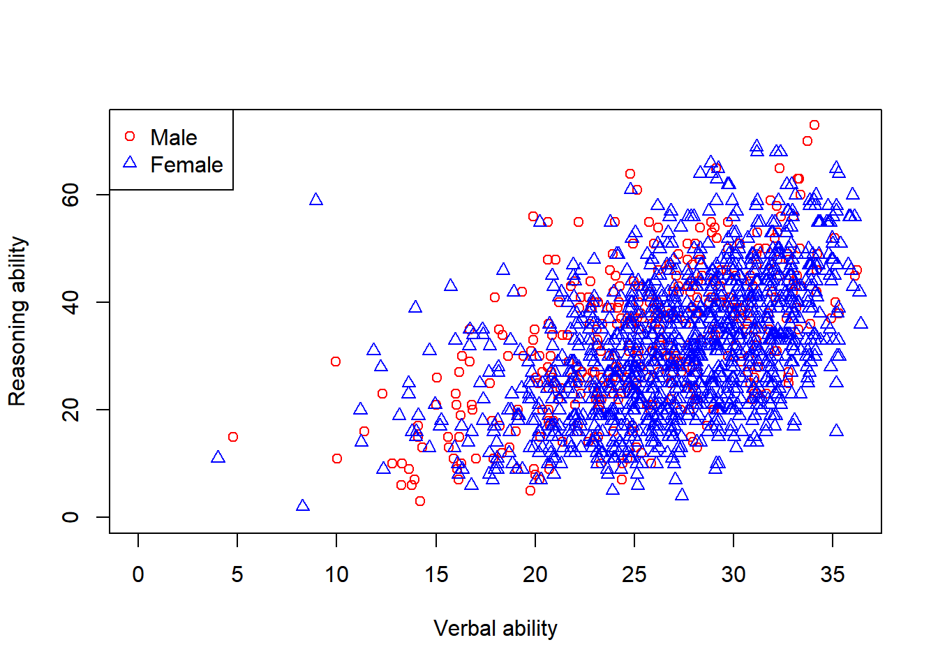
We can further add regression lines to figure.
plotfirst plots the data for the male participants.xlim: the range of x-axisylim: the range of y-axiscol: the color of the plot
pointscan add another layer of plot to the existing plot. It cannot be used without an existing plot already.pch: the character to represent a data point
abline: add a line with given intercept and slopelty: type of lineslwd: width of lines
legend: add a legend to the plot.
plot(x = jitter(hvltt[sex==1], factor = 2), y = reason[sex==1],
     xlab = "Verbal ability", ylab = "Reasoning ability",
     xlim=c(0, max(hvltt)), ylim=c(0, max(reason)), col='red')

points(x = jitter(hvltt[sex==2], factor = 2), y = reason[sex==2],
       col='blue', pch=2)

abline(lm(reason[sex==1] ~ hvltt[sex==1]), col='red', lty=1, lwd=3)

abline(lm(reason[sex==2] ~ hvltt[sex==2]), col='blue', lty=2, lwd=2)

legend('topleft', c('Male', 'Female'), col=c('red','blue'),
       pch = c(1,2), lty=c(1,2))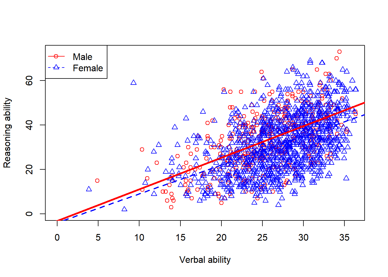
9.3 ggplot2 - The Layered Grammar of Graphics
Wickham (2010) proposed some general rules to build a statistical graph that serves as the basis of the popular R package ggplot2 and many other visualization packages.
Each plot can have several layers and each layer has the following components, explicitly or implicitly.
- data and aesthetic mappings,
- geometric objects,
- the coordinate system
- scales,
- statistical transformations, and
- facet specification.
9.3.1 An example
We now plot the ACTIVE data again.
ggplot() +
  layer(
    data = active, geom = 'point', stat = 'identity',
    mapping = aes(x = hvltt, y = reason), position = 'identity'
  ) +
  scale_y_continuous() +
  scale_x_continuous() +
  coord_cartesian()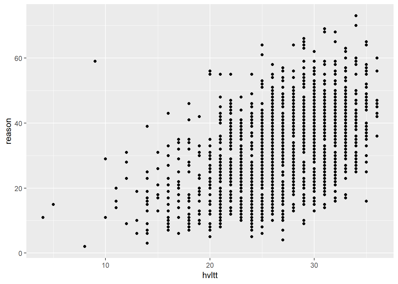
To generate the above plot:
ggplot: starts the plot arealayer: creates a new layer of plot. A layer is a combination of data, stat, geom, and aesthetic mappings with a potential position adjustment.data: a data framegeom: the geometric object to display the data such as a point, a droplet, a line, etc.stat: how to use or transform the data.identityis to use the data as is.mapping: connect the variables in the data with the plotting element.position: how to arrange geoms in the plot, e.g., just put where it is or permutate its position or stack them together.
scale_y_continuousandscale_x_continuous: how to map data from the data set to the aesthetic attributes of a plot.coord_cartesian:coord_specify the type of coordinate system to be used.
The full options can be found in the document of ggplot2. A fast reference is given below.


We can also change the title and labels of a plot.
ggplot() +
  layer(
    data = active, geom = 'point', stat = 'identity',
    mapping = aes(x = hvltt, y = reason), position = 'identity'
  ) +
  scale_y_continuous() +
  scale_x_continuous() +
  coord_cartesian() +
  ggtitle('Relationship between verbal and reasoning ability') +
  xlab('Verbal ability') +
  ylab('Reasoning ability')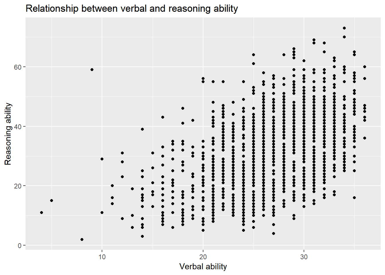
Note that by default, the title is left-justified. To center the title, one needs to change the “theme” of a plot.
ggplot() +
  layer(
    data = active, geom = 'point', stat = 'identity',
    mapping = aes(x = hvltt, y = reason), position = 'identity'
  ) +
  scale_y_continuous() +
  scale_x_continuous() +
  coord_cartesian() +
  ggtitle('Relationship between verbal and reasoning ability') +
  xlab('Verbal ability') +
  ylab('Reasoning ability') +
  theme_classic() +
  theme(plot.title = element_text(hjust = 0.5))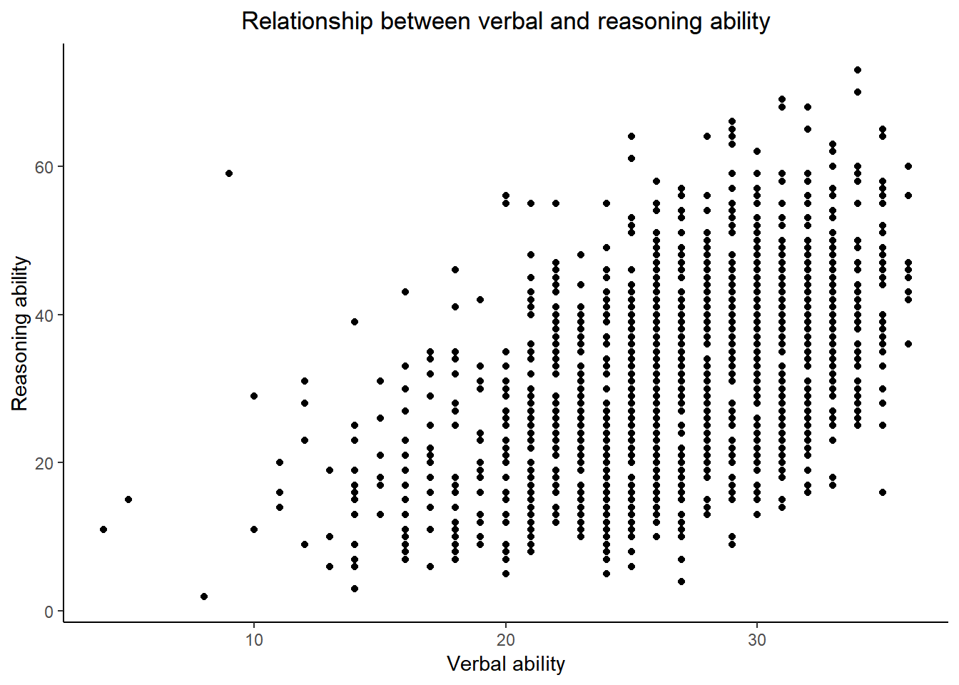
We can also permutate the data.
ggplot() +
  layer(
    data = active, geom = 'point', stat = 'identity',
    mapping = aes(x = hvltt, y = reason), position = 'jitter'
  ) +
  scale_y_continuous() +
  scale_x_continuous() +
  coord_cartesian() +
  ggtitle('Relationship between verbal and reasoning ability') +
  xlab('Verbal ability') +
  ylab('Reasoning ability')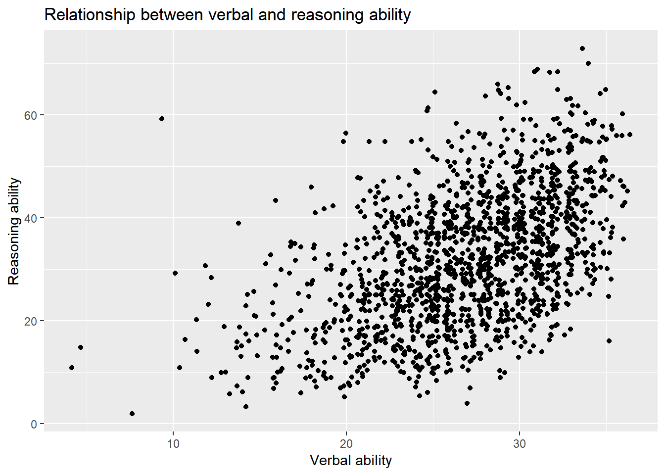
More layers can be added to a plot. For example, we can add the regression line to the scatter plot.
ggplot() +
  layer(
    data = active, geom = 'point', stat = 'identity',
    mapping = aes(x = hvltt, y = reason), position = 'jitter'
  ) +
  layer(
    data = active, geom = 'smooth', stat = 'smooth', params = list(method = "lm"),
    mapping = aes(x = hvltt, y = reason), position = 'identity'
  ) +
  scale_y_continuous() +
  scale_x_continuous() +
  coord_cartesian() +
  ggtitle('Relationship between verbal and reasoning ability') +
  xlab('Verbal ability') +
  ylab('Reasoning ability')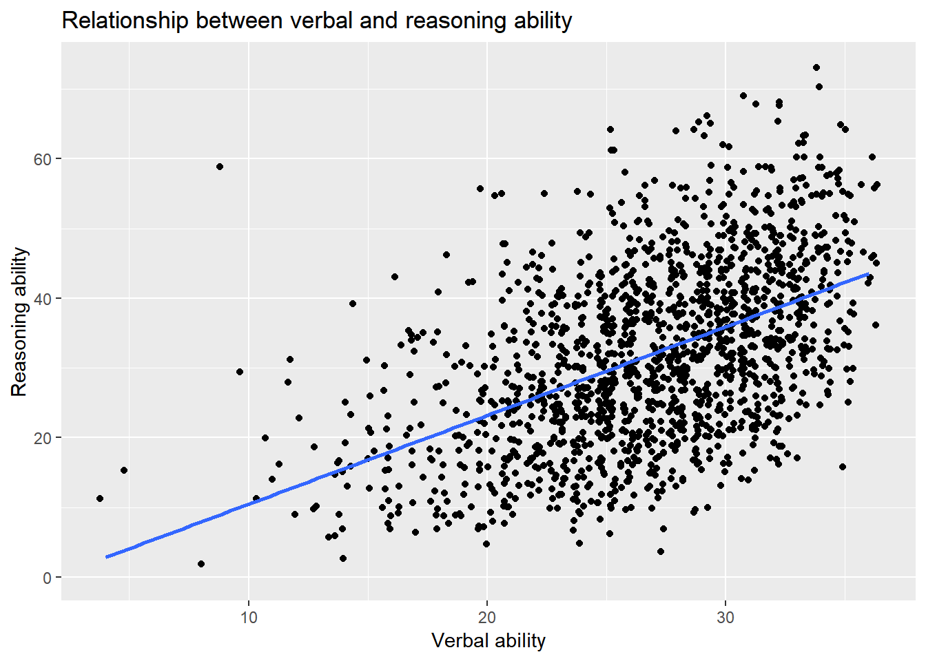
ggplot2 provides a unified way to generate all kinds of plots. But comparing the code of ggplot2 with the plot function we used earlier, it seemed to be more tedious or verbose to use ggplot2. However, in a plot, an intelligent guess can be used to avoid the setup of many parameters to simplify the plotting process. For example, for the same plot above, we can use
ggplot(active, aes(hvltt, reason)) +
  geom_point() +
  geom_smooth(method=lm) +
  labs(title = 'Relationship between verbal and reasoning ability',
       x = 'Verbal ability', y = 'Reasoning ability')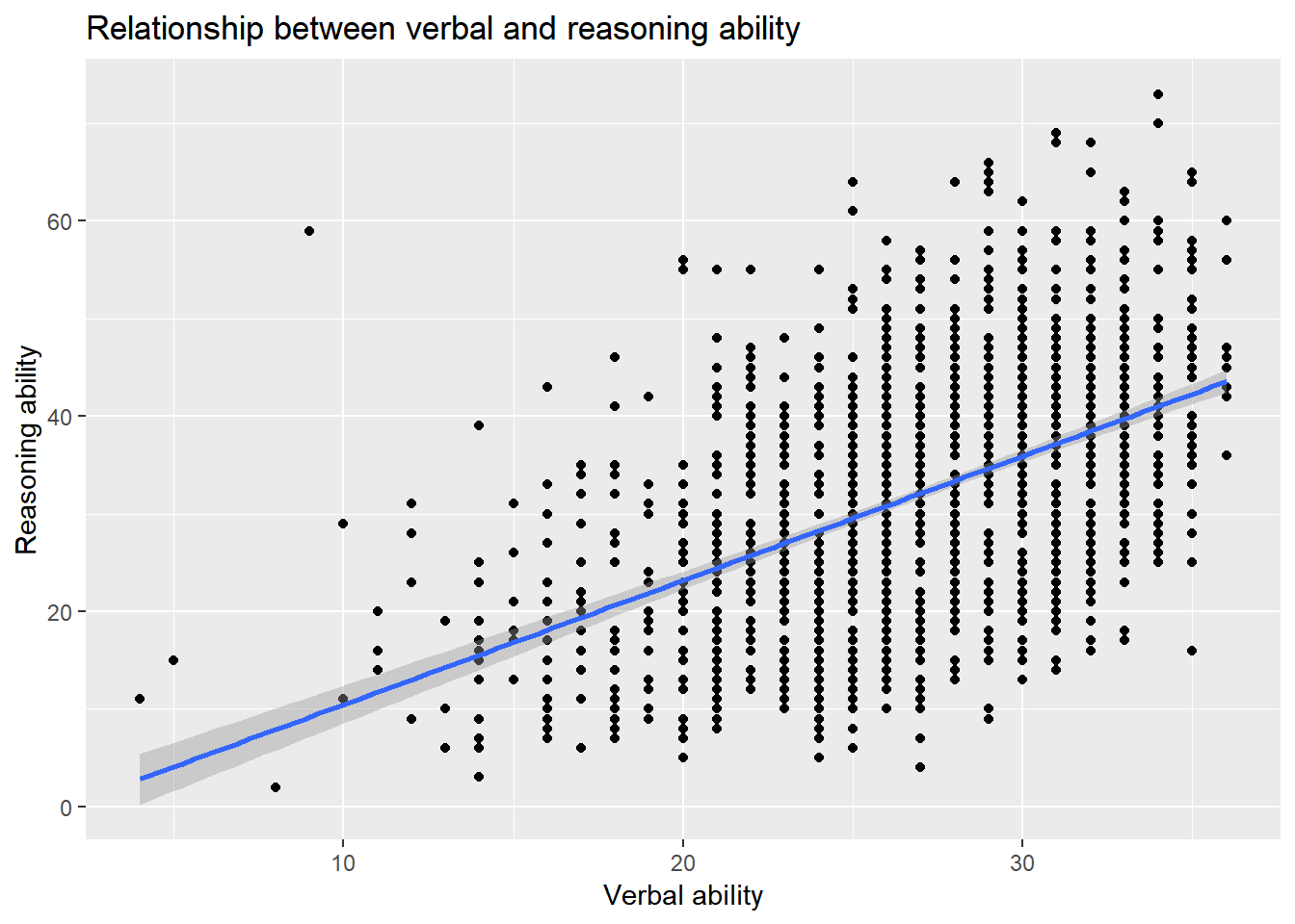
- The two layers share the same data so we put them together in
ggplot. - The function
geom_pointis defined to generate a scatterplot. Nothing is specified in the function because all the defaults are used. One can change the default if needed. - The function
geom_smoothis used to plot the regression line. By default, the smoothing method will be used. We change the default tomethod=lmto produce a regression line instead. - We also combine the title and labels together using the function
labs.
ggplot2 also provides a quick plot function qplot similiar to plot function in the R base package. For example,
qplot(hvltt, reason)
qplot(hvltt, reason, geom=c('jitter','smooth'), method='lm')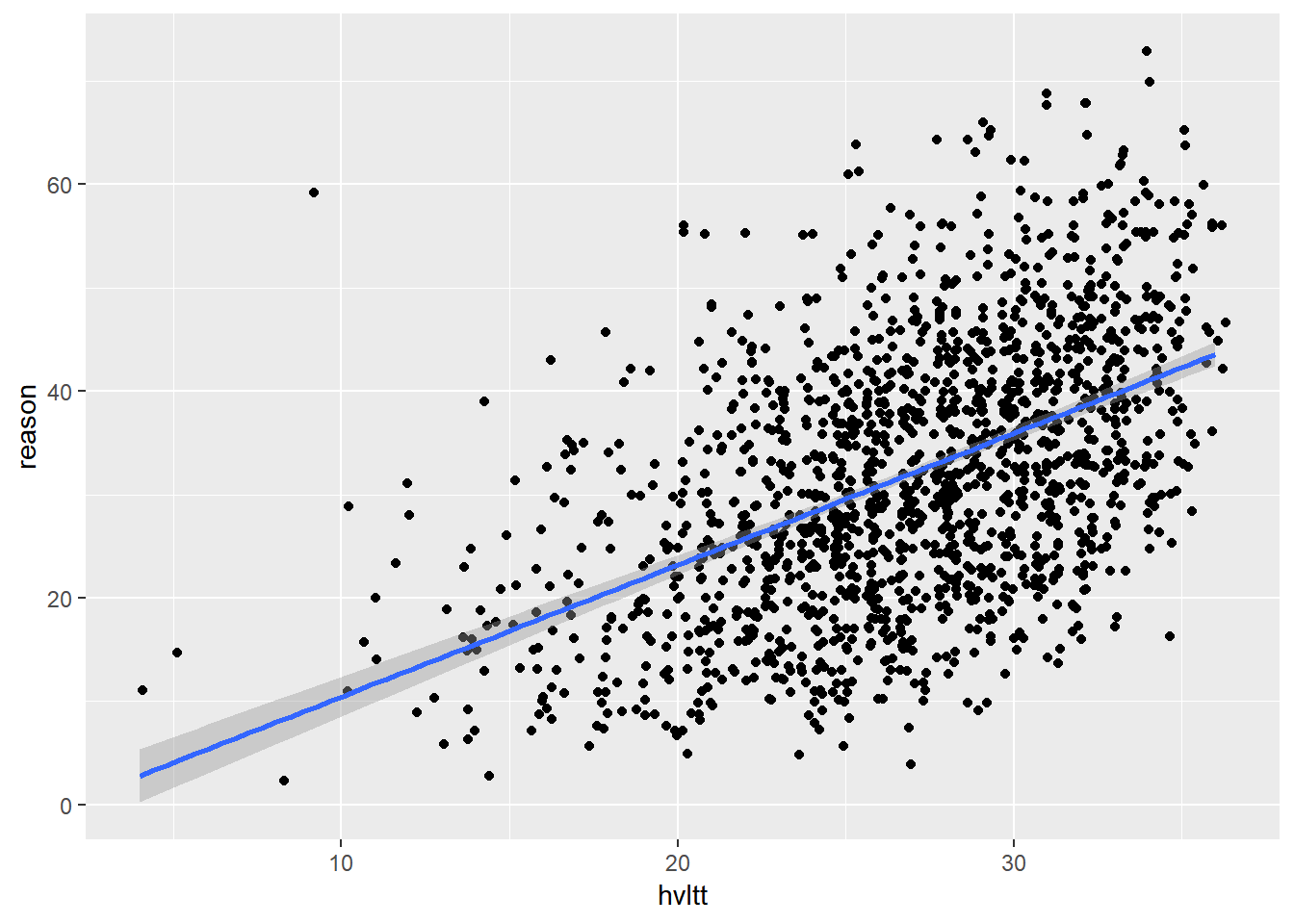
9.3.2 Grouping
Previously, we plotted the data according to a third variable. For example, we can have different colors and shapes for different groups. This can be done easily using ggplot2.
ggplot(data = active) +
  geom_jitter(aes(hvltt, reason, color = sex))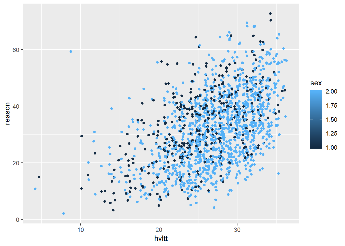
ggplot(data = active) +
  geom_jitter(aes(hvltt, reason, color = age))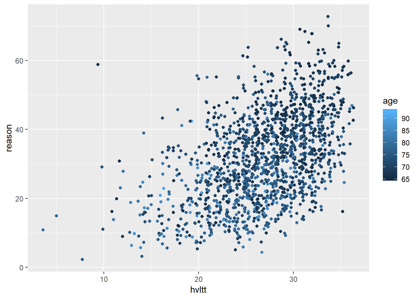
In most situations, it is beneficial to convert the grouping variable to a factor and label each category informatively.
active$sex2 <- factor(active$sex, levels=1:2, labels=c('Male', 'Female'))
active$group2 <- factor(active$group, levels=1:4,
                        labels = c('Memory', 'Reasoning', 'Speed', 'Control'))
ggplot(data = active) +
  geom_jitter(aes(hvltt, reason, color = sex2))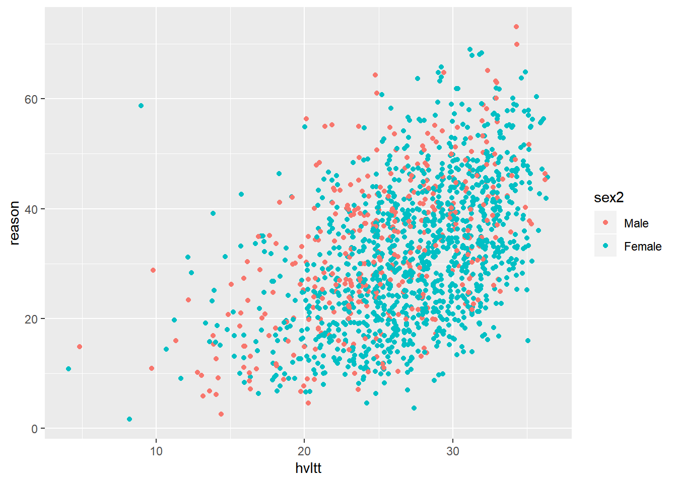
ggplot(data = active) +
  geom_jitter(aes(hvltt, reason, color = group2, shape = group2)) +
  scale_color_discrete(name="Treatment\nGroups") +
  scale_shape_discrete(name="Treatment\nGroups")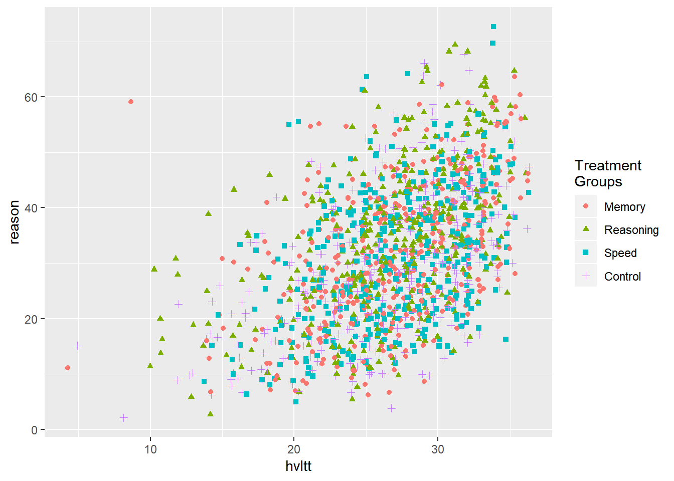
Multiple layers can be created, too.
ggplot(data = active, aes(hvltt, reason, color = group2, shape = group2)) +
  geom_jitter() +
  geom_smooth(method=lm, se=FALSE) +
  scale_color_discrete(name="Treatment\nGroups") +
  scale_shape_discrete(name="Treatment\nGroups")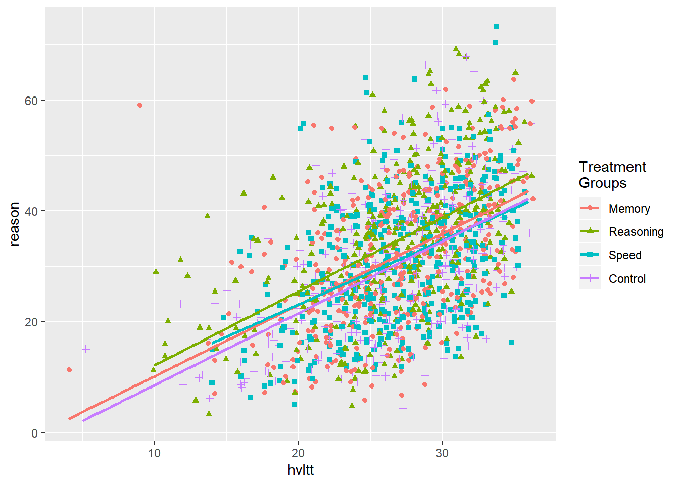
9.3.3 Faceting
We can also generate a plot for each subset of data. This kind of plot is called conditioned or trellis plots. In ggplot2, it is called faceting. By faceting, we plot make plots for a subset of data.
ggplot(active, aes(hvltt, reason)) +
  geom_point() +
  facet_wrap(~ sex)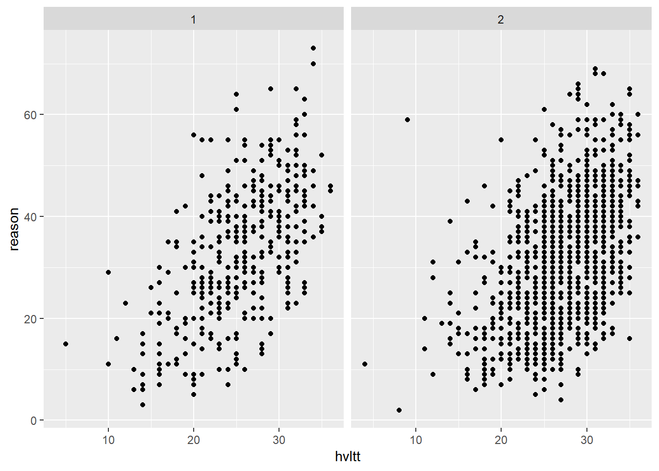
Again, it is often beneficial to convert the grouping variable to a factor and label each category informatively.
active$sex2 <- factor(active$sex, levels=1:2, labels=c('Male', 'Female'))
active$group2 <- factor(active$group, levels=1:4,
                        labels = c('Memory', 'Reasoning', 'Speed', 'Control'))

ggplot(active, aes(hvltt, reason)) +
  geom_point() +
  facet_wrap(~ sex2)
ggplot(active, aes(hvltt, reason)) +
  geom_point() +
  facet_wrap(~ sex2, labeller = label_both)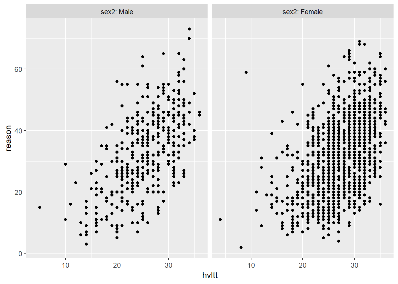
The faceting can be done on more than one variable.
ggplot(active, aes(hvltt, reason)) +
  geom_point() +
  facet_wrap(~ sex2*group2, nrow = 2)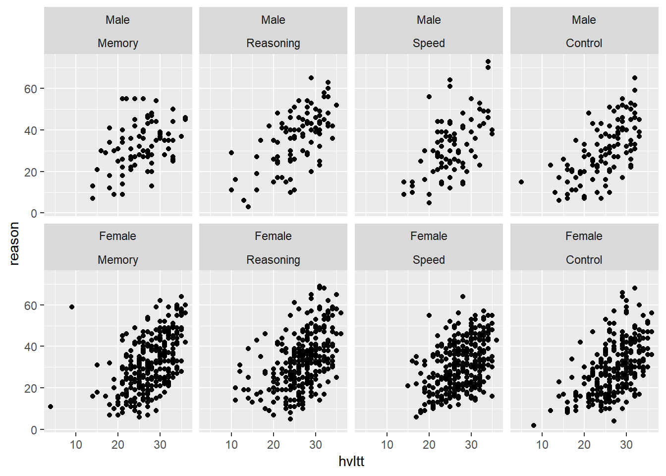
ggplot(active, aes(hvltt, reason)) +
  geom_point() +
  facet_grid(sex2 ~ group2)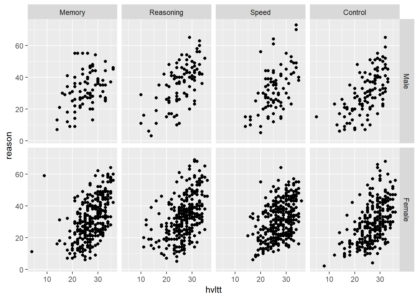
9.4 Specific types of plot
9.4.1 Bar plot - geom_bar
A bar plot or bar graph is a chart of rectangular bars with their lengths proportional to the values or proportions that they represent. It is good for displaying the distribution of a categorical variable.
9.4.1.1 A simple barpot
ggplot(data = active) +
  geom_bar(aes(group2, fill = group2)) +
  theme(legend.position = "none")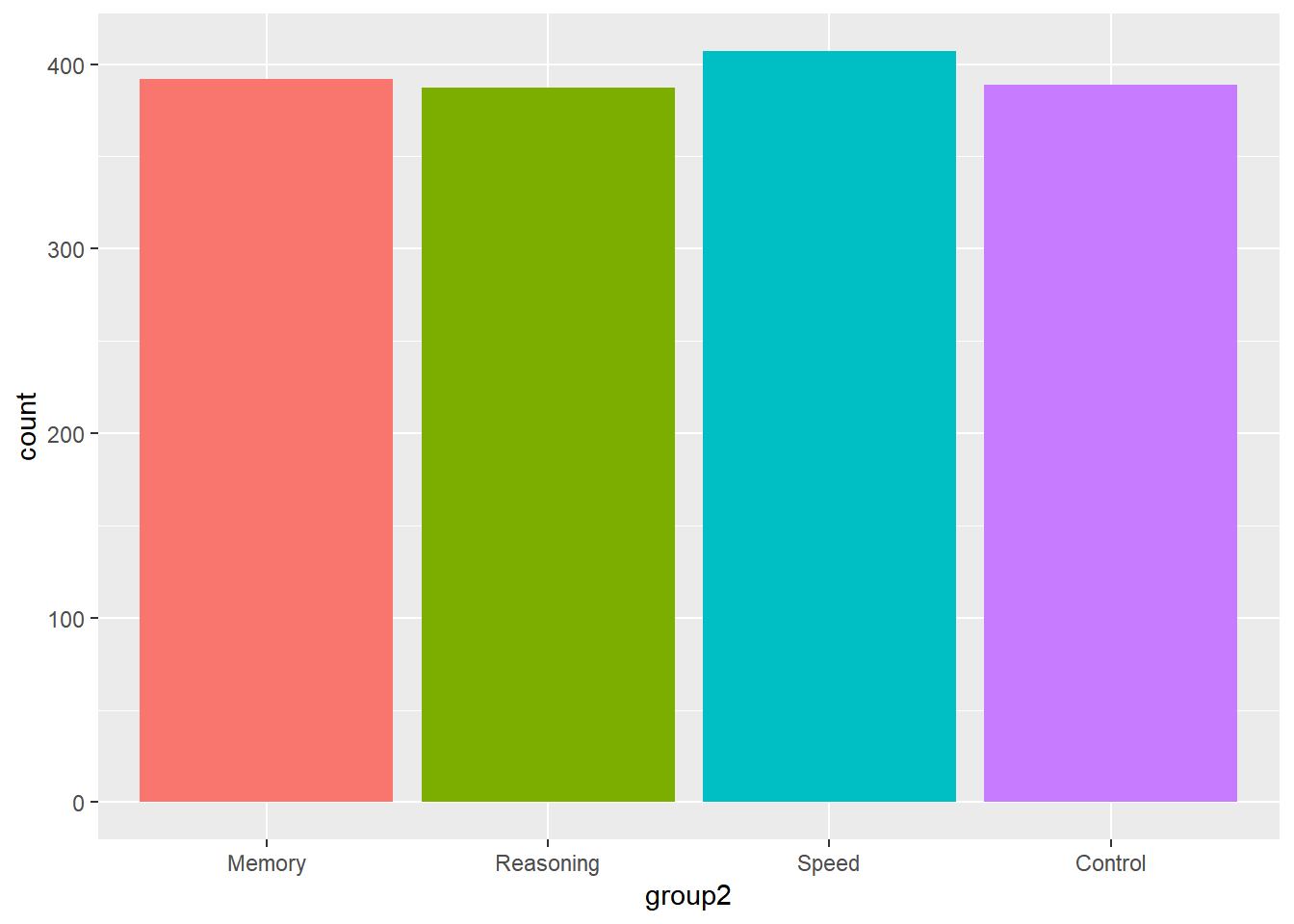
9.4.1.2 Grouped barplot
We can stack the barplot together
ggplot(data = active) +
  geom_bar(aes(group2, fill = sex2), position = "stack")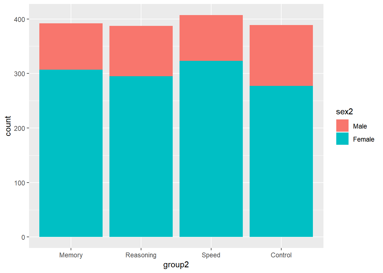
ggplot(data = active) +
  geom_bar(aes(group2, fill = sex2), position = "fill")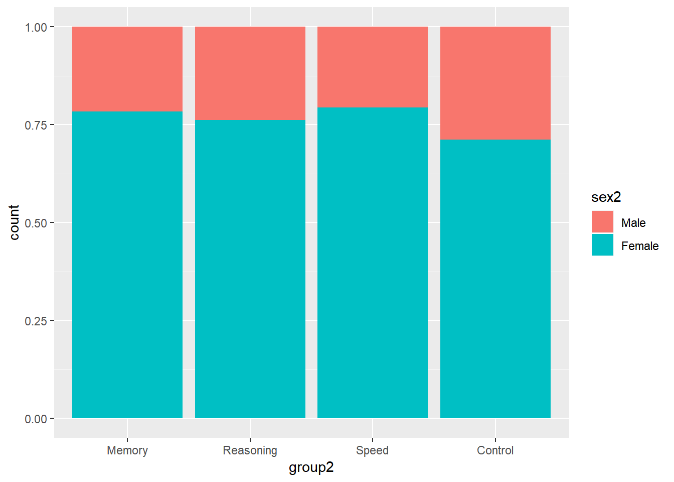
Or put them side by side.
ggplot(data = active) +
  geom_bar(aes(group2, fill = sex2), position = "dodge")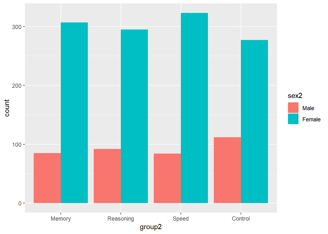
9.4.2 Boxplot
9.4.2.1 A simple boxplot
A box plot or boxplot (also known as a box-and-whisker diagram or plot) is a convenient way of graphically displaying summaries of a variable. Often times, the five-number summary is used: the smallest observation, lower quartile (Q1), median (Q2), upper quartile (Q3), and largest observation.
ggplot(data = active) +
  geom_boxplot(aes(y = hvltt))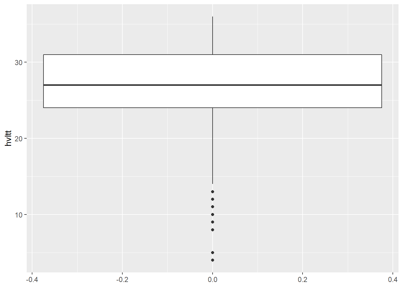
9.4.2.2 Grouped boxplot
ggplot(data = active) +
  geom_boxplot(aes(x = group2, y = hvltt))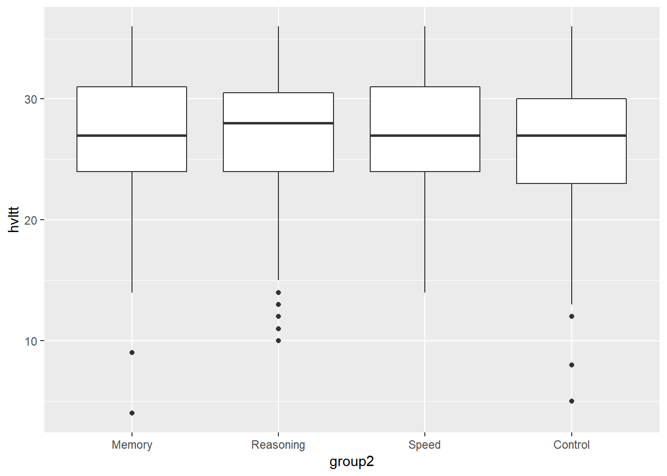
ggplot(data = active) +
  geom_boxplot(aes(x = group2, y = hvltt)) +
  coord_flip()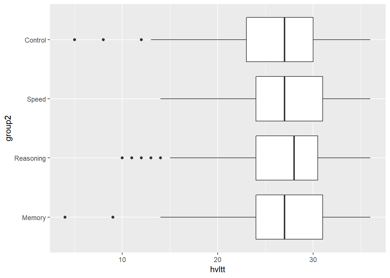
9.4.3 Histogram
A histogram is a graphical display of frequencies over a set of continuous intervals for a continuous variable. The range of a variable is divided into a list of equal intervals. Within each interval, the number of participants, frequency, is counted. Then, the frequencies can be plotted with attached bars. Heights of the bars stand for frequencies or relative frequencies.
9.4.3.1 A simple histogram
ggplot(data = active, aes(x = hvltt)) +
  geom_histogram(bins = 20)
Plot the density instead of count
ggplot(data = active, aes(x = hvltt)) +
  geom_histogram(bins = 20, aes(y = ..density..))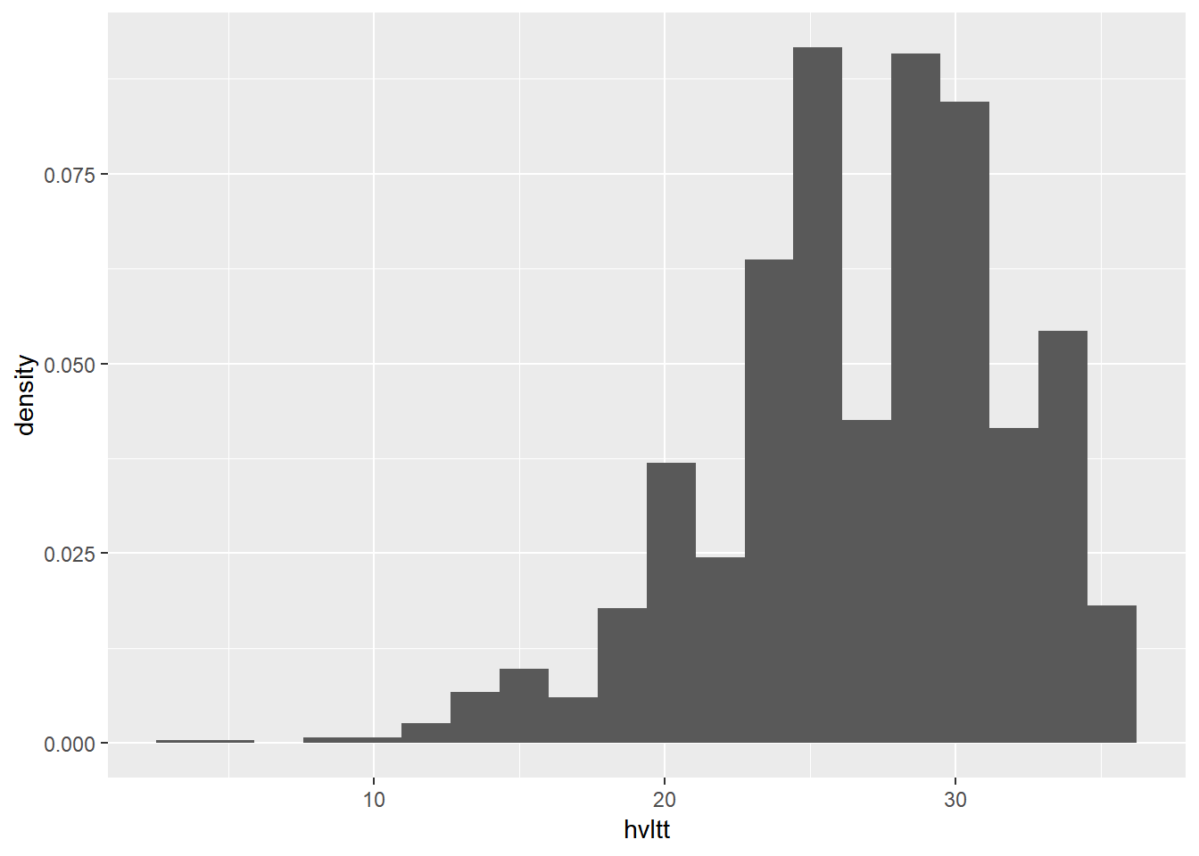
9.4.3.2 Histogram with a density curve
ggplot(data = active, aes(x = hvltt)) +
  geom_histogram(bins = 20, aes(y = ..density..)) +
  geom_density(size=1.5, color='red')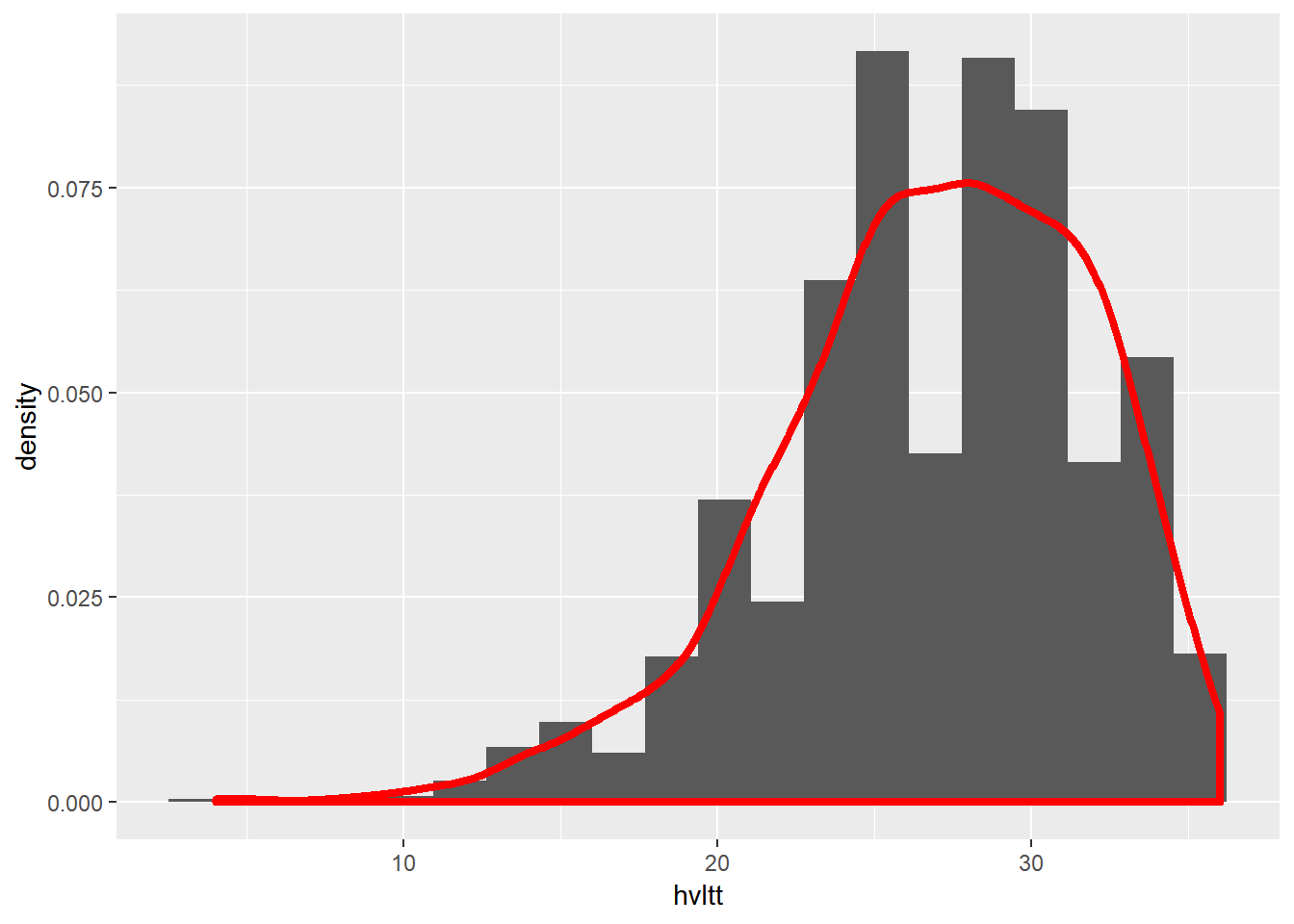
9.4.3.3 Multiple-group histogram
ggplot(active, aes(x=hvltt, fill=sex2)) +
    geom_histogram(alpha=.5, position="identity")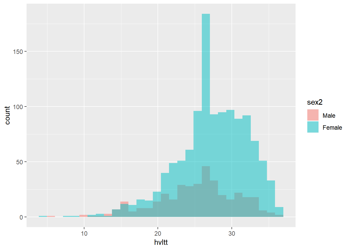
ggplot(active, aes(x=hvltt, fill=sex2)) +
    geom_histogram(position="identity")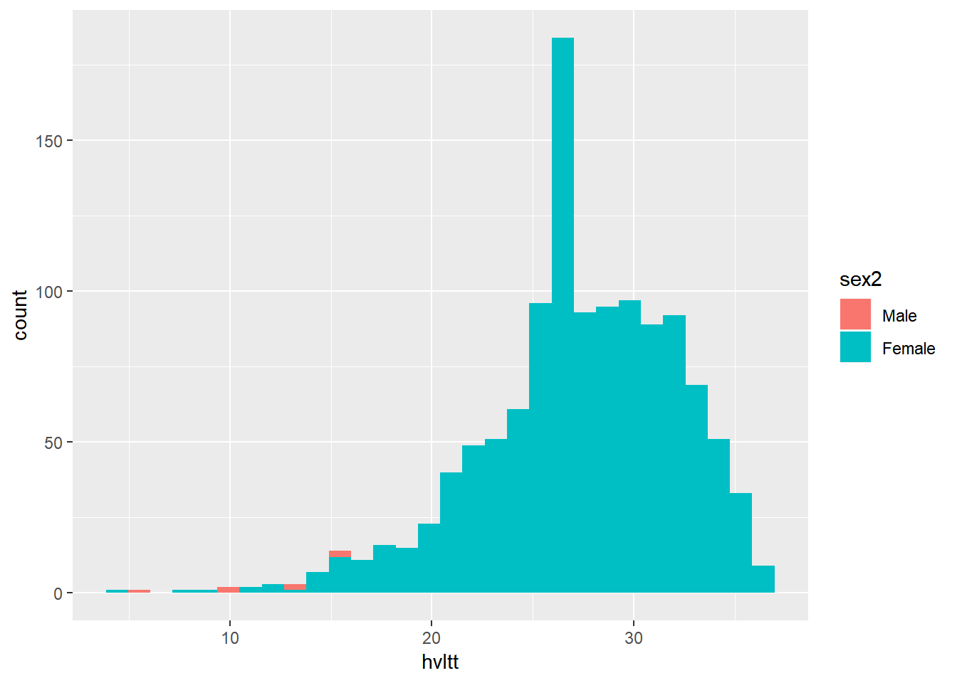
ggplot(active, aes(x=hvltt, fill=sex2)) +
    geom_density(alpha = 0.3)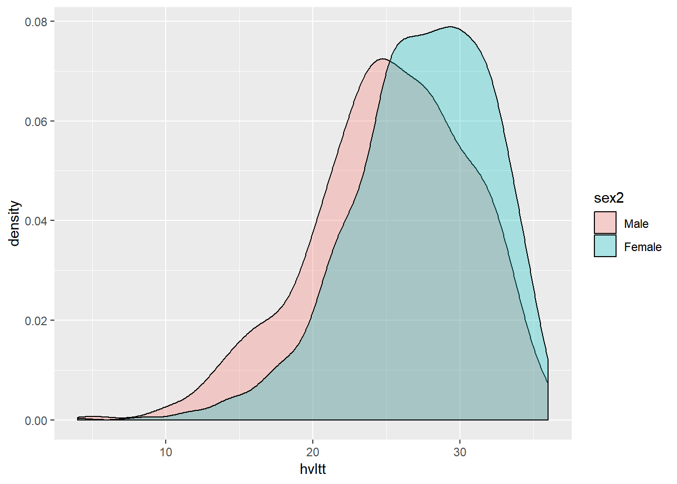
ggplot(active, aes(x=hvltt, color=sex2)) +
    geom_density(alpha = 0.3)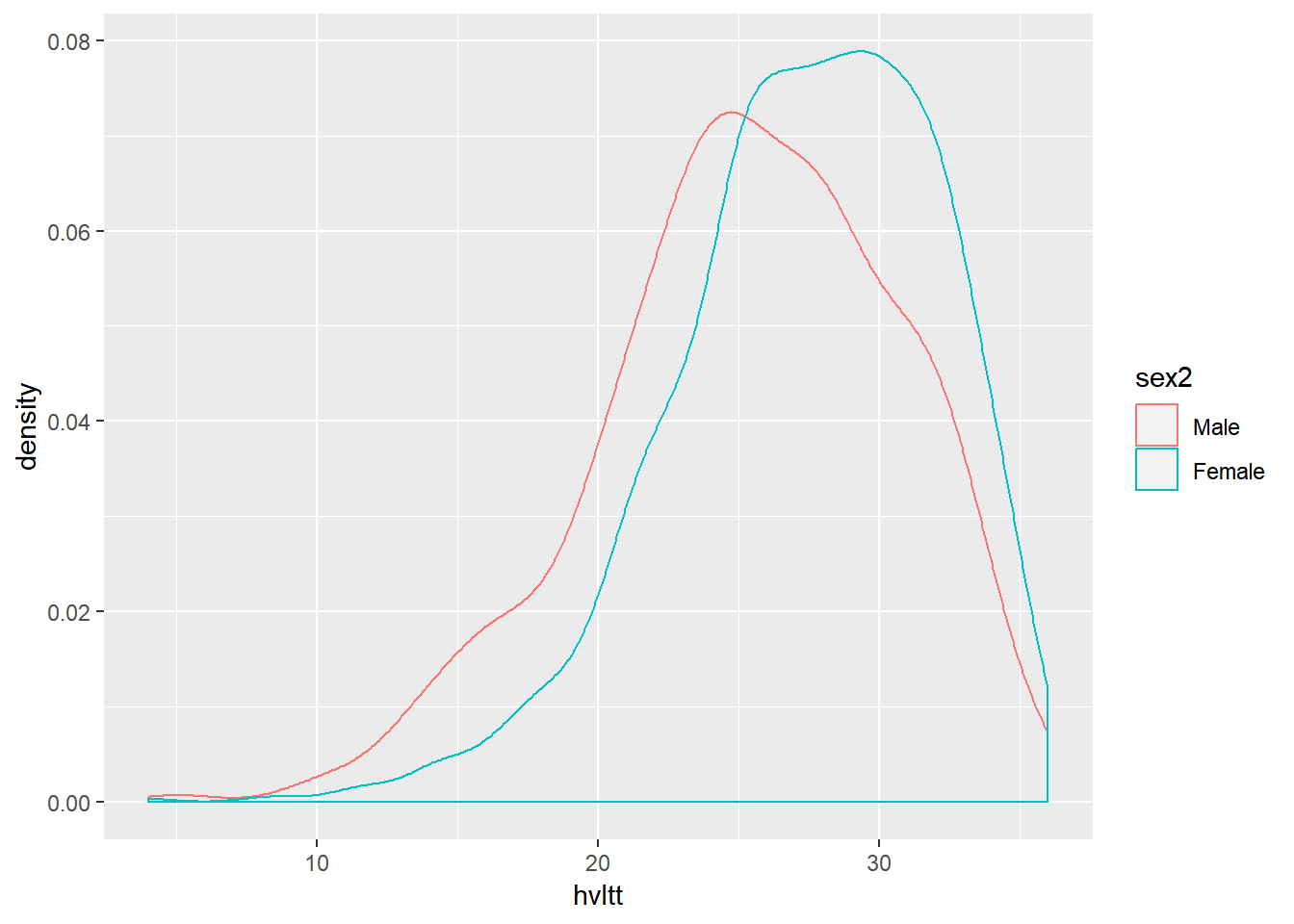
ggplot(active, aes(x=hvltt, group=sex2)) +
    geom_density(alpha = 0.3)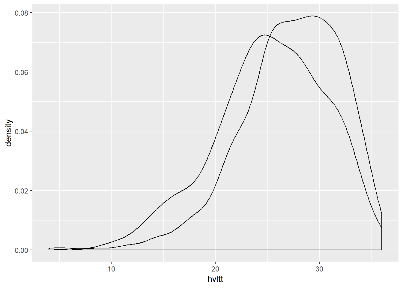
9.4.4 Line plot
9.4.4.1 A simple line plot
data.example <- data.frame(time=1:4, hvltt=c(28,28,17,22))

ggplot(data=data.example, aes(x=time, y=hvltt)) +
  geom_line()+
  geom_point()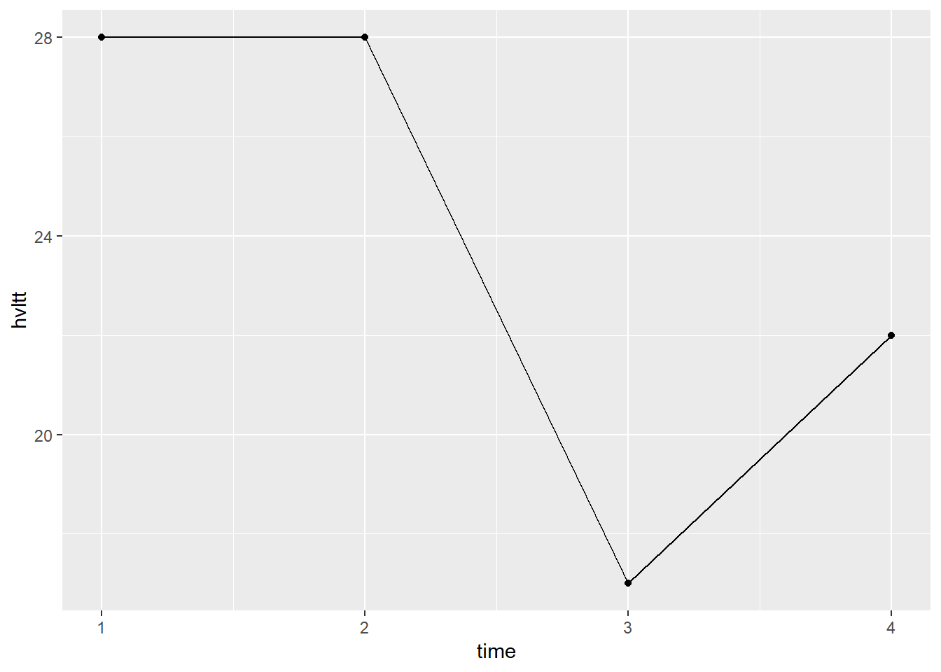
ggplot(data=data.example, aes(x=time, y=hvltt)) +
  geom_line(color='red', linetype="dashed", size=1.1)+
  geom_point(size=3, color='blue')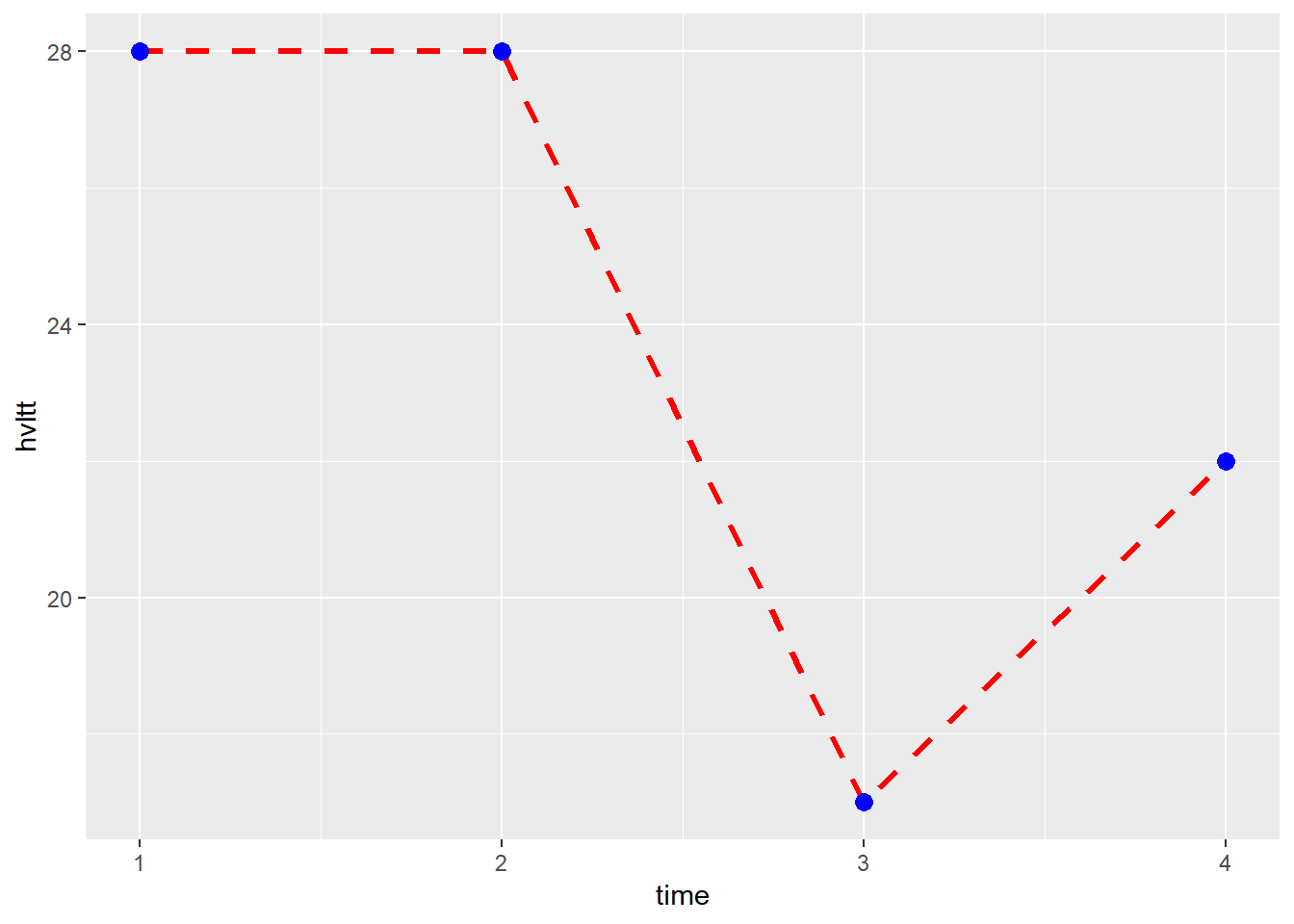
As an example, we plot the active data.
active.long <- active %>%
                  select(id, sex, starts_with('hvlt')) %>%
                  gather(starts_with('hvlt'),
                         key='item', value='hvltt') %>%
                  arrange(id)

ggplot(data=active.long, aes(x=item, y=hvltt, group=id)) +
  geom_line() +
  xlab('Time')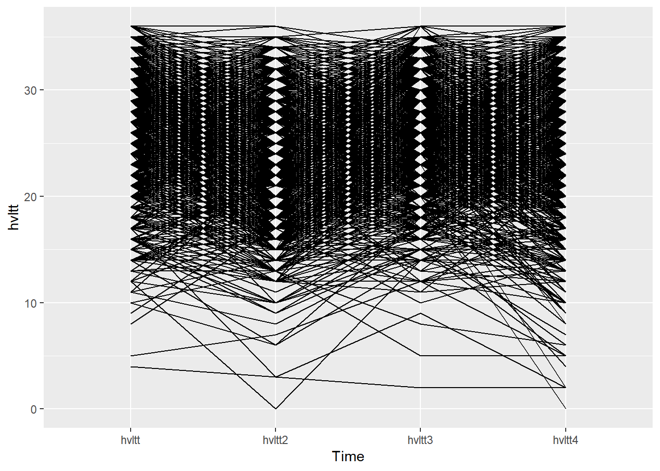
ggplot(data=active.long, aes(x=item, y=hvltt, color=id)) +
  geom_line() +
  xlab('Time')
ggplot(data=active.long, aes(x=item, y=hvltt, group=id)) +
  geom_line() +
  xlab('Time') +
  stat_summary(aes(group = 1, color='red'), geom = "point",
               fun.y = mean, size = 3) +
  stat_summary(aes(group = 1, color='red'), geom = "line",
               fun.y = mean, size = 2)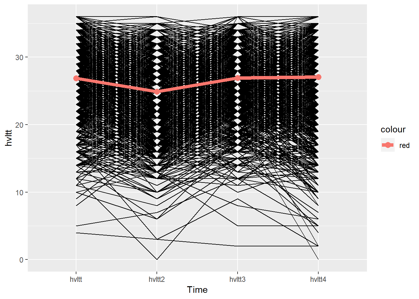
ggplot(data=active.long, aes(x=item, y=hvltt, group=id)) +
  geom_line() +
  xlab('Time') +
  stat_summary(aes(group = 1), color='red', geom = "point",
               fun.y = mean, size = 3) +
  stat_summary(aes(group = 1), color='red', geom = "line",
               fun.y = mean, size = 2)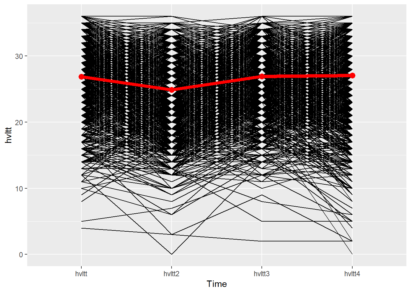
9.4.5 Maps
Every location on earth has a global address that can be specified by two numbers - latitude and longitude. latitude is a geographic coordinate that specifies the north-south position of a point on the Earth’s surface. Latitude ranges from 0° at the Equator to 90° (North or South) at the poles. A positive number is used for a position on the Northern Hemisphere and a negative number is used for the Southern Hemisphere. Longitude is a geographic coordinate that specifies the east-west position of a point on the Earth’s surface. By convention, the Prime Meridian, which passes through the Royal Observatory, Greenwich, England, was allocated the position of 0° longitude. The longitude of other places is measured as the angle east or west from the Prime Meridian, ranging from 0° at the Prime Meridian to +180° eastward and −180° westward.

9.4.5.1 Plot simple map outlines
Plotting data on a map is interesting but not an easy job. ggplot2 and some R packages built based on it has made it easy. A map is simply a polygon. Therefore, with the particular shape data, a map can be generated.
The package maps includes the map outline data. For example, for the world map, we have:
world <- map_data("world")
str(world)
## 'data.frame':    99338 obs. of  6 variables:
##  $ long     : num  -69.9 -69.9 -69.9 -70 -70.1 ...
##  $ lat      : num  12.5 12.4 12.4 12.5 12.5 ...
##  $ group    : num  1 1 1 1 1 1 1 1 1 1 ...
##  $ order    : int  1 2 3 4 5 6 7 8 9 10 ...
##  $ region   : chr  "Aruba" "Aruba" "Aruba" "Aruba" ...
##  $ subregion: chr  NA NA NA NA ...

ggplot() + geom_polygon(data = world,
                        aes(x=long, y = lat, group = group)) +
  coord_fixed(1.3)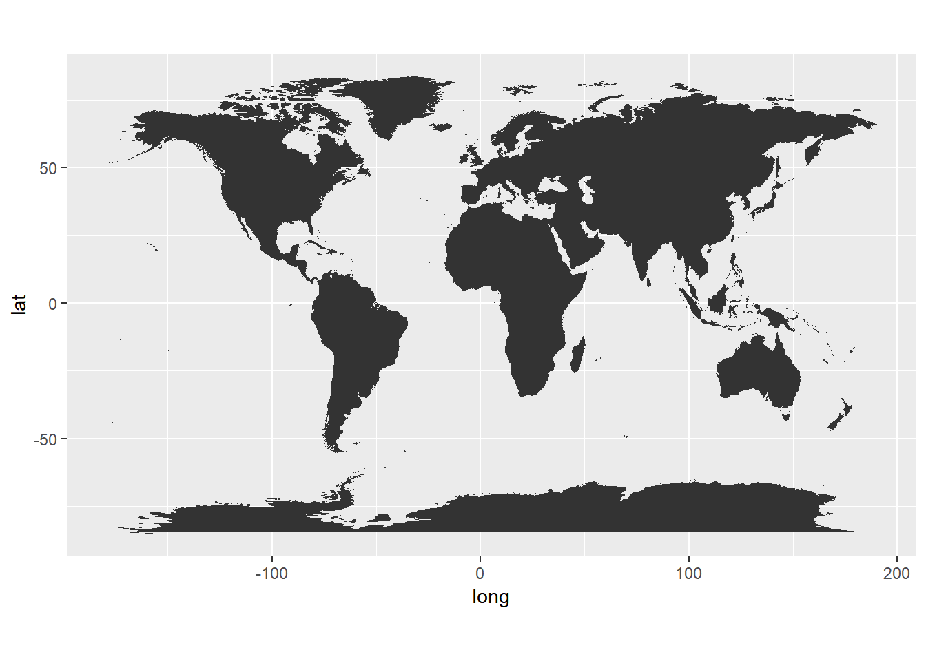
ggplot() + geom_polygon(data = world,
                        aes(x=long, y = lat)) +
  coord_fixed(1.3)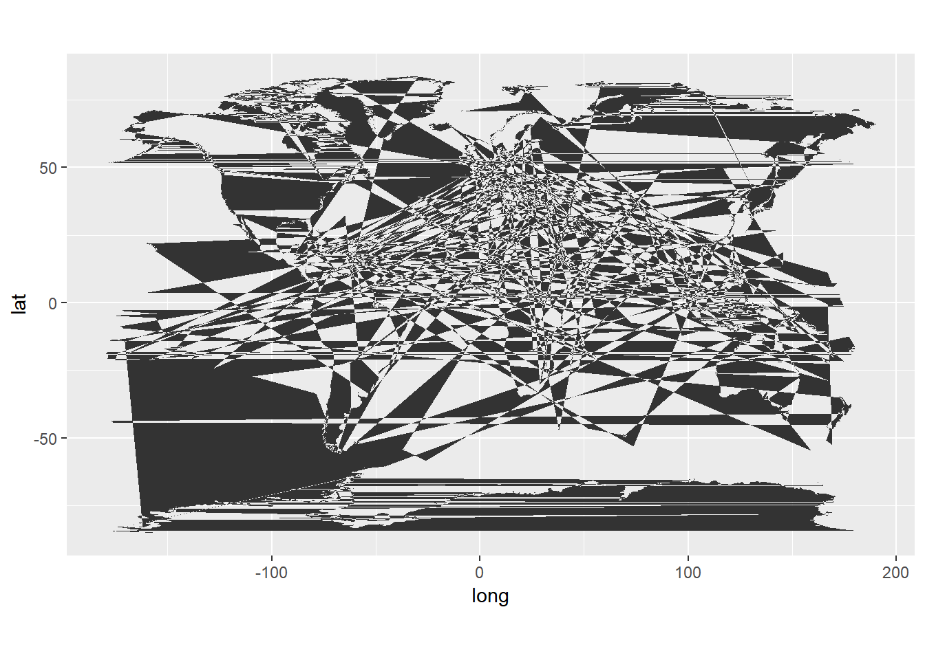
- Data
- long is longitude. Things to the west of the prime meridian are negative.
- lat is latitude.
- order. This just shows in which order ggplot should “connect the dots”
- region and subregion tell what region or subregion a set of points surrounds.
- group. This is very important! ggplot2’s functions can take a group argument which controls (amongst other things) whether adjacent points should be connected by lines. If they are in the same group, then they get connected, but if they are in different groups then they don’t. Essentially, having two points in different groups means that ggplot “lifts the pen” when going between them.
- Plot
- Maps in this format can be plotted with the polygon geom. i.e. using
geom_polygon. geom_polygondrawn lines between points and “closes them up” (i.e. draws a line from the last point back to the first point)- You have to map the
groupaesthetic to the group column - Of course,
x = longandy = latare the other aesthetics. coord_fixedfixes the relationship between one unit in the y direction and one unit in the x direction. It is basically the width/height ratio
- Maps in this format can be plotted with the polygon geom. i.e. using
We now focus on the US map. The outline of the map can be obtained using the data below.
usa <- map_data("usa")
str(usa)
## 'data.frame':    7243 obs. of  6 variables:
##  $ long     : num  -101 -101 -101 -101 -101 ...
##  $ lat      : num  29.7 29.7 29.7 29.6 29.6 ...
##  $ group    : num  1 1 1 1 1 1 1 1 1 1 ...
##  $ order    : int  1 2 3 4 5 6 7 8 9 10 ...
##  $ region   : chr  "main" "main" "main" "main" ...
## $ subregion: chr NA NA NA NA ...ggplot() + geom_polygon(data = usa, fill=NA, color='blue',
aes(x=long, y = lat, group = group)) +
coord_fixed(1.3) 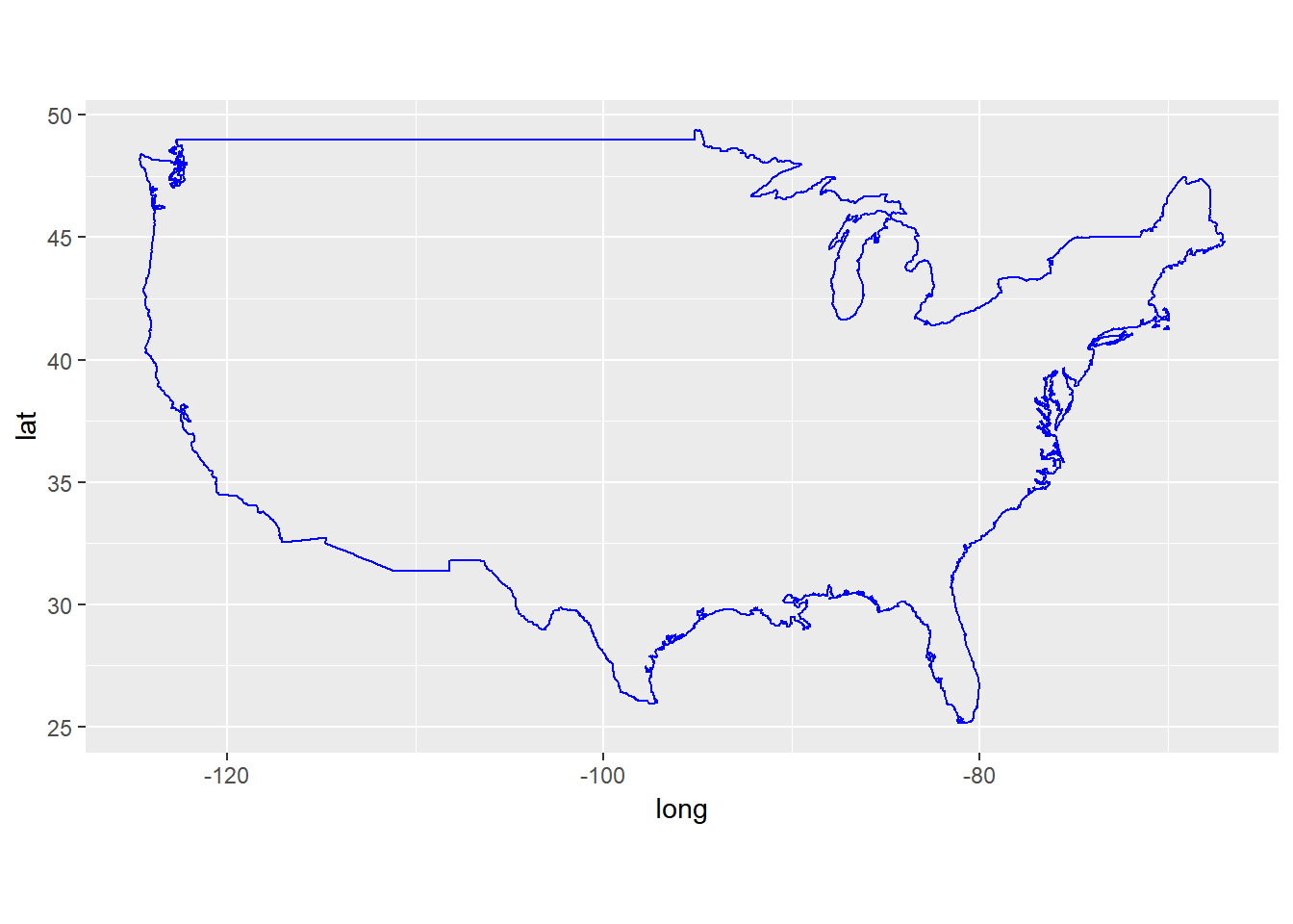
We now turn to state maps. The data come with maps package only include the United States mainland generated from US Department of the Census data.
usstates <- map_data('state')
head(usstates)
##        long      lat group order  region subregion
## 1 -87.46201 30.38968     1     1 alabama      <NA>
## 2 -87.48493 30.37249     1     2 alabama      <NA>
## 3 -87.52503 30.37249     1     3 alabama      <NA>
## 4 -87.53076 30.33239     1     4 alabama      <NA>
## 5 -87.57087 30.32665     1     5 alabama      <NA>
## 6 -87.58806 30.32665     1     6 alabama      <NA>

ggplot(data = usstates) +
  geom_polygon(aes(x = long, y = lat, fill = region, group = group), color = "white") +
  coord_fixed(1.3) +
guides(fill=FALSE) 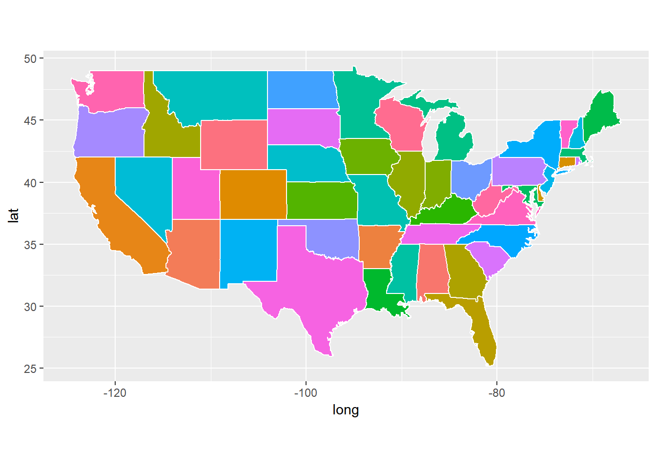
ggplot(data = usstates) +
  geom_polygon(aes(x = long, y = lat, fill = region, group = group), color = "white") +
  coord_fixed(1.3)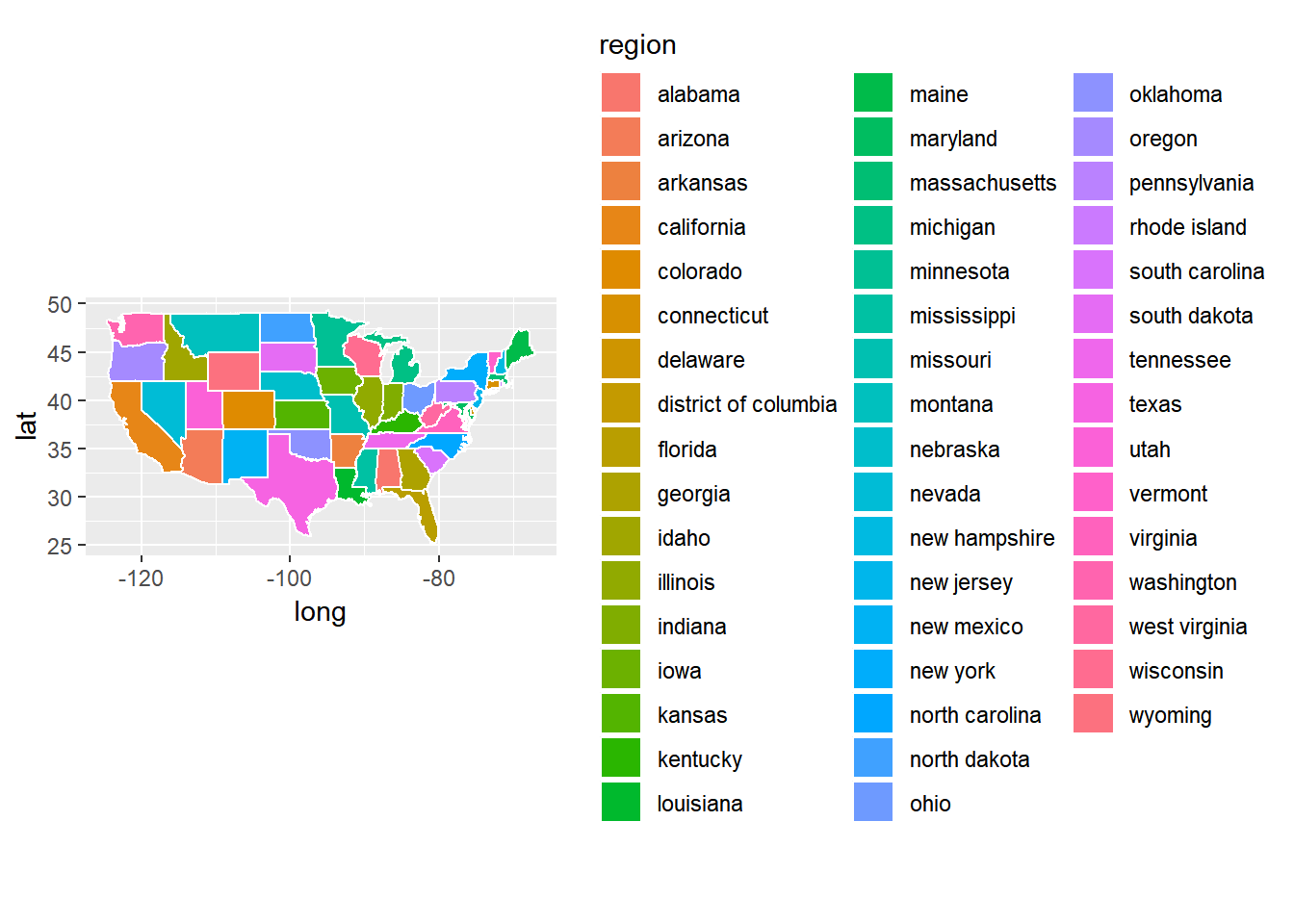
The county-level data for the US are also available.
uscounty <- map_data('county')
head(uscounty)
##        long      lat group order  region subregion
## 1 -86.50517 32.34920     1     1 alabama   autauga
## 2 -86.53382 32.35493     1     2 alabama   autauga
## 3 -86.54527 32.36639     1     3 alabama   autauga
## 4 -86.55673 32.37785     1     4 alabama   autauga
## 5 -86.57966 32.38357     1     5 alabama   autauga
## 6 -86.59111 32.37785     1     6 alabama   autauga

ggplot(data = uscounty) +
  geom_polygon(aes(x = long, y = lat, fill = region, group = group), color = "white") +
  coord_fixed(1.3) +
guides(fill=FALSE) 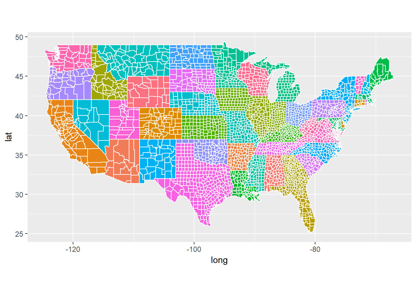
We now turn to a particular state, Indiana.
indiana <- subset(uscounty, region == "indiana")
ggplot(data = indiana) +
  geom_polygon(aes(x = long, y = lat, fill = subregion, group = group), color = "white") +
  coord_fixed(1.3) +
  guides(fill=FALSE)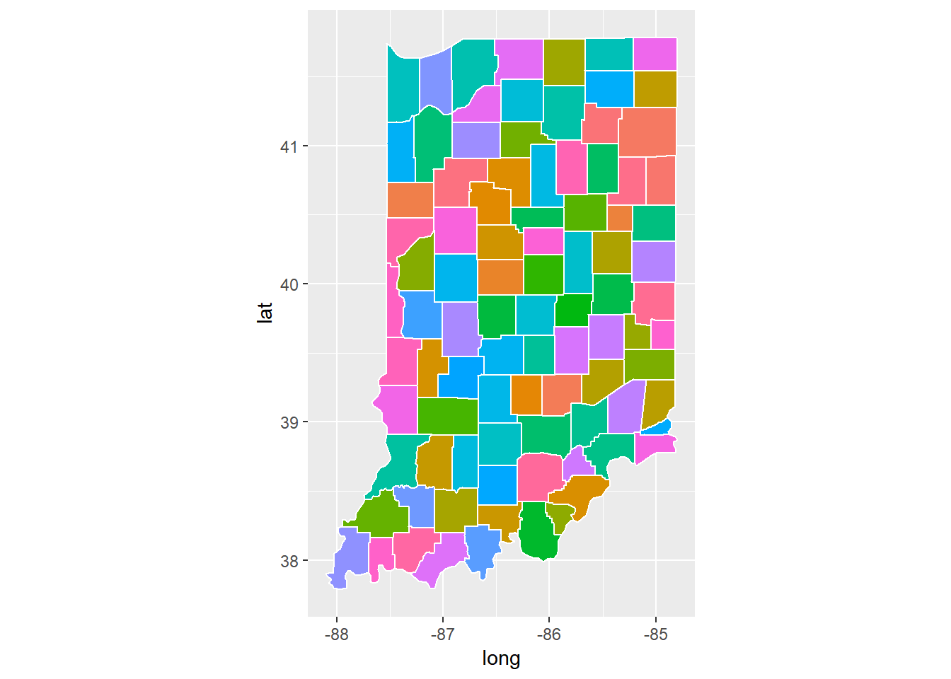
We can remove some of the information to keep the map only.
map_theme <- theme(axis.line=element_blank(),
      axis.text.x=element_blank(),
      axis.text.y=element_blank(),
      axis.ticks=element_blank(),
      axis.title.x=element_blank(),
      axis.title.y=element_blank(),
      legend.position="none",
      panel.background=element_blank(),
      panel.border=element_blank(),
      panel.grid.major=element_blank(),
      panel.grid.minor=element_blank(),
      plot.background=element_blank())

ggplot(data = indiana) +
  geom_polygon(aes(x = long, y = lat, fill = subregion, group = group), color = "white") +
  coord_fixed(1.3) +
  guides(fill=FALSE) +
  map_theme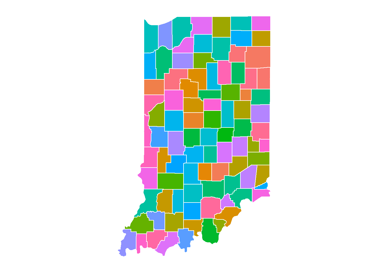
9.4.5.2 Displaying data on maps
We can display data on maps. Here, we will display some county-level data of the state of Indiana. The information we will use includes education data and population data. The education data are available on this webpage: http://www.stats.indiana.edu/web/county/edattain00.asp. The population data are available here: http://www.stats.indiana.edu/population/PopTotals/historic_counts_counties.asp.
Instead of typing the data manually, we will use the R package htmltab to directly get the data into R.
## education data
edu <- htmltab(doc="http://www.stats.indiana.edu/web/county/edattain00.asp")

## population data
population <- htmltab(doc="http://www.stats.indiana.edu/population/PopTotals/historic_counts_counties.asp")

demo.data <- cbind(edu[, c(6, 8)], population[, c(1, 12:13)])

## change variable names
names(demo.data) <- c('edu2010', 'edu1990', 'subregion', 'pop2000', 'pop2010')

## remove the first line of data
demo.data <- demo.data[-1, ]

## convert to numeric
demo.data$edu1990 <- as.numeric(demo.data$edu1990)
demo.data$edu2010 <- as.numeric(demo.data$edu2010)

## first replace comma and then change to numeric
demo.data$pop2000 <- as.numeric(gsub(",", "", demo.data$pop2000))
demo.data$pop2010 <- as.numeric(gsub(",", "", demo.data$pop2010))

## convert uppper case to lower case letters
demo.data$subregion <- tolower(demo.data$subregion)

## calculate a difference score
demo.data$edudiff <- demo.data$edu2010 - demo.data$edu1990
demo.data$popdiff <- demo.data$pop2010 - demo.data$pop2000
We can then combine the information with the map data.
indiana <- inner_join(indiana, demo.data, by = "subregion")
str(indiana)
## 'data.frame':    1501 obs. of  12 variables:
##  $ long     : num  -84.8 -85.1 -85.1 -84.8 -84.8 ...
##  $ lat      : num  40.6 40.6 40.9 40.9 40.7 ...
##  $ group    : num  663 663 663 663 663 663 664 664 664 664 ...
##  $ order    : int  23681 23682 23683 23684 23685 23686 23688 23689 23690 23691 ...
##  $ region   : chr  "indiana" "indiana" "indiana" "indiana" ...
##  $ subregion: chr  "adams" "adams" "adams" "adams" ...
##  $ edu2010  : num  10.7 10.7 10.7 10.7 10.7 10.7 22.7 22.7 22.7 22.7 ...
##  $ edu1990  : num  10.7 10.7 10.7 10.7 10.7 10.7 19 19 19 19 ...
##  $ pop2000  : num  33625 33625 33625 33625 33625 ...
##  $ pop2010  : num  34387 34387 34387 34387 34387 ...
##  $ edudiff  : num  0 0 0 0 0 0 3.7 3.7 3.7 3.7 ...
##  $ popdiff  : num  762 762 762 762 762 ...
We now plot the population data on maps.
map_theme <- theme(
  axis.text = element_blank(),
  axis.line = element_blank(),
  axis.ticks = element_blank(),
  panel.border = element_blank(),
  panel.grid = element_blank(),
  axis.title = element_blank()
  )

ggplot(data = indiana) +
  geom_polygon(aes(x = long, y = lat, fill = pop2010, group = group), color = "white") +
  coord_fixed(1.3) +
  map_theme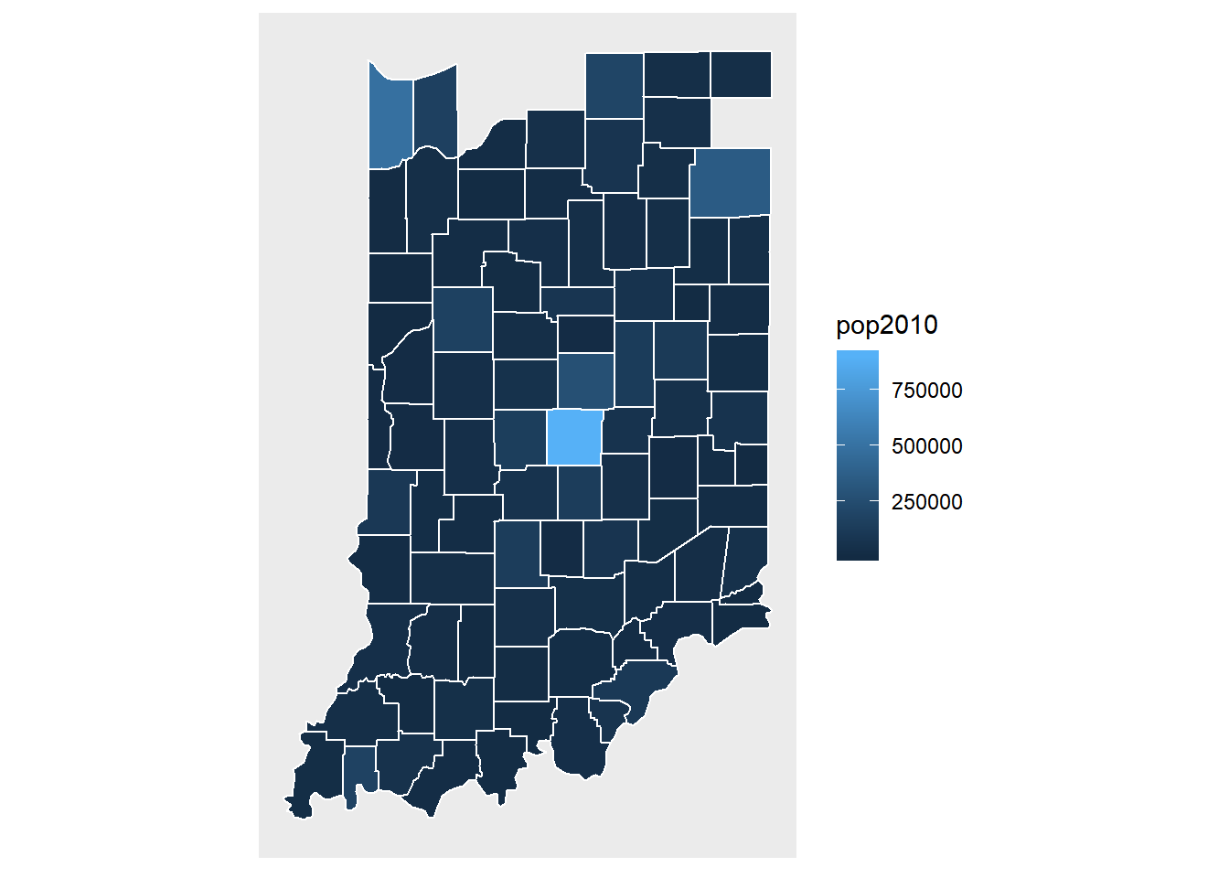
Notice the missing pieces.
indiana <- subset(uscounty, region == "indiana")
name1 <- unique(indiana$subregion)
name2 <- unique(demo.data$subregion)
cbind(name1,name2)
##       name1         name2
##  [1,] "adams"       "adams"
##  [2,] "allen"       "allen"
##  [3,] "bartholomew" "bartholomew"
##  [4,] "benton"      "benton"
##  [5,] "blackford"   "blackford"
##  [6,] "boone"       "boone"
##  [7,] "brown"       "brown"
##  [8,] "carroll"     "carroll"
##  [9,] "cass"        "cass"
## [10,] "clark"       "clark"
## [11,] "clay"        "clay"
## [12,] "clinton"     "clinton"
## [13,] "crawford"    "crawford"
## [14,] "daviess"     "daviess"
## [15,] "dearborn"    "dearborn"
## [16,] "decatur"     "decatur"
## [17,] "de kalb"     "dekalb"
## [18,] "delaware"    "delaware"
## [19,] "dubois"      "dubois"
## [20,] "elkhart"     "elkhart"
## [21,] "fayette"     "fayette"
## [22,] "floyd"       "floyd"
## [23,] "fountain"    "fountain"
## [24,] "franklin"    "franklin"
## [25,] "fulton"      "fulton"
## [26,] "gibson"      "gibson"
## [27,] "grant"       "grant"
## [28,] "greene"      "greene"
## [29,] "hamilton"    "hamilton"
## [30,] "hancock"     "hancock"
## [31,] "harrison"    "harrison"
## [32,] "hendricks"   "hendricks"
## [33,] "henry"       "henry"
## [34,] "howard"      "howard"
## [35,] "huntington"  "huntington"
## [36,] "jackson"     "jackson"
## [37,] "jasper"      "jasper"
## [38,] "jay"         "jay"
## [39,] "jefferson"   "jefferson"
## [40,] "jennings"    "jennings"
## [41,] "johnson"     "johnson"
## [42,] "knox"        "knox"
## [43,] "kosciusko"   "kosciusko"
## [44,] "lagrange"    "lagrange"
## [45,] "lake"        "lake"
## [46,] "la porte"    "laporte"
## [47,] "lawrence"    "lawrence"
## [48,] "madison"     "madison"
## [49,] "marion"      "marion"
## [50,] "marshall"    "marshall"
## [51,] "martin"      "martin"
## [52,] "miami"       "miami"
## [53,] "monroe"      "monroe"
## [54,] "montgomery"  "montgomery"
## [55,] "morgan"      "morgan"
## [56,] "newton"      "newton"
## [57,] "noble"       "noble"
## [58,] "ohio"        "ohio"
## [59,] "orange"      "orange"
## [60,] "owen"        "owen"
## [61,] "parke"       "parke"
## [62,] "perry"       "perry"
## [63,] "pike"        "pike"
## [64,] "porter"      "porter"
## [65,] "posey"       "posey"
## [66,] "pulaski"     "pulaski"
## [67,] "putnam"      "putnam"
## [68,] "randolph"    "randolph"
## [69,] "ripley"      "ripley"
## [70,] "rush"        "rush"
## [71,] "st joseph"   "st. joseph"
## [72,] "scott"       "scott"
## [73,] "shelby"      "shelby"
## [74,] "spencer"     "spencer"
## [75,] "starke"      "starke"
## [76,] "steuben"     "steuben"
## [77,] "sullivan"    "sullivan"
## [78,] "switzerland" "switzerland"
## [79,] "tippecanoe"  "tippecanoe"
## [80,] "tipton"      "tipton"
## [81,] "union"       "union"
## [82,] "vanderburgh" "vanderburgh"
## [83,] "vermillion"  "vermillion"
## [84,] "vigo"        "vigo"
## [85,] "wabash"      "wabash"
## [86,] "warren"      "warren"
## [87,] "warrick"     "warrick"
## [88,] "washington"  "washington"
## [89,] "wayne"       "wayne"
## [90,] "wells"       "wells"
## [91,] "white"       "white"
## [92,] "whitley"     "whitley"
name1 == name2
##  [1]  TRUE  TRUE  TRUE  TRUE  TRUE  TRUE  TRUE  TRUE  TRUE  TRUE  TRUE  TRUE
## [13]  TRUE  TRUE  TRUE  TRUE FALSE  TRUE  TRUE  TRUE  TRUE  TRUE  TRUE  TRUE
## [25]  TRUE  TRUE  TRUE  TRUE  TRUE  TRUE  TRUE  TRUE  TRUE  TRUE  TRUE  TRUE
## [37]  TRUE  TRUE  TRUE  TRUE  TRUE  TRUE  TRUE  TRUE  TRUE FALSE  TRUE  TRUE
## [49]  TRUE  TRUE  TRUE  TRUE  TRUE  TRUE  TRUE  TRUE  TRUE  TRUE  TRUE  TRUE
## [61]  TRUE  TRUE  TRUE  TRUE  TRUE  TRUE  TRUE  TRUE  TRUE  TRUE FALSE  TRUE
## [73]  TRUE  TRUE  TRUE  TRUE  TRUE  TRUE  TRUE  TRUE  TRUE  TRUE  TRUE  TRUE
## [85]  TRUE  TRUE  TRUE  TRUE  TRUE  TRUE  TRUE  TRUE

demo.data$subregion <- name1

indiana <- inner_join(indiana, demo.data, by = "subregion")


ggplot(data = indiana) +
  geom_polygon(aes(x = long, y = lat, fill = pop2010, group = group), color = "white") +
  coord_fixed(1.3) +
  scale_fill_gradient(trans = "log10") +
  map_theme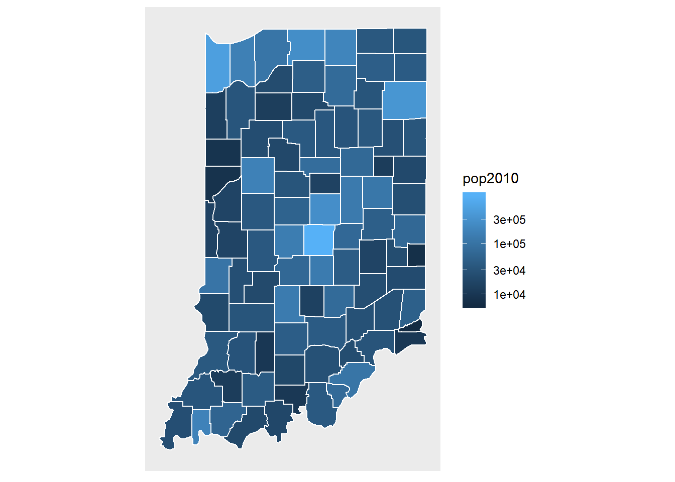
ggplot(data = indiana) +
  geom_polygon(aes(x = long, y = lat, fill = pop2010, group = group), color = "white") +
  coord_fixed(1.3) +
  map_theme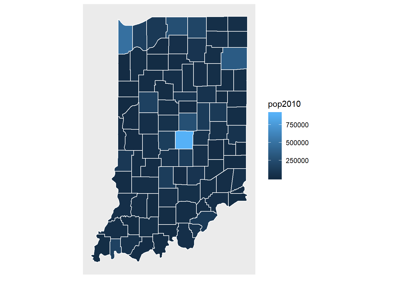
We now visualize the change of population for Indiana counties.
pop.change.plot <- ggplot(data = indiana) +
  geom_polygon(aes(x = long, y = lat, fill = cut(popdiff,breaks=c(-3500, -100, 100, 100000)), group = group), color = "white") +
  coord_fixed(1.3) +
  map_theme +
  scale_fill_discrete(name="Population", labels=c('Move out', 'No change', 'Move in'))

pop.change.plot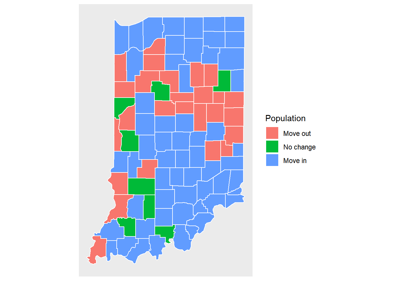
pop.change.plot <- ggplot(data = indiana) +
  geom_polygon(aes(x = long, y = lat, fill =popdiff, group = group), color = "white") +
  coord_fixed(1.3) +
  map_theme

pop.change.plot
We now label each county using its name.
cnames <- aggregate(cbind(long, lat) ~ subregion, data=indiana, FUN=mean)

pop.change.plot +
  geom_text(data=cnames, aes(long, lat, label = substr(subregion, 1, 2)))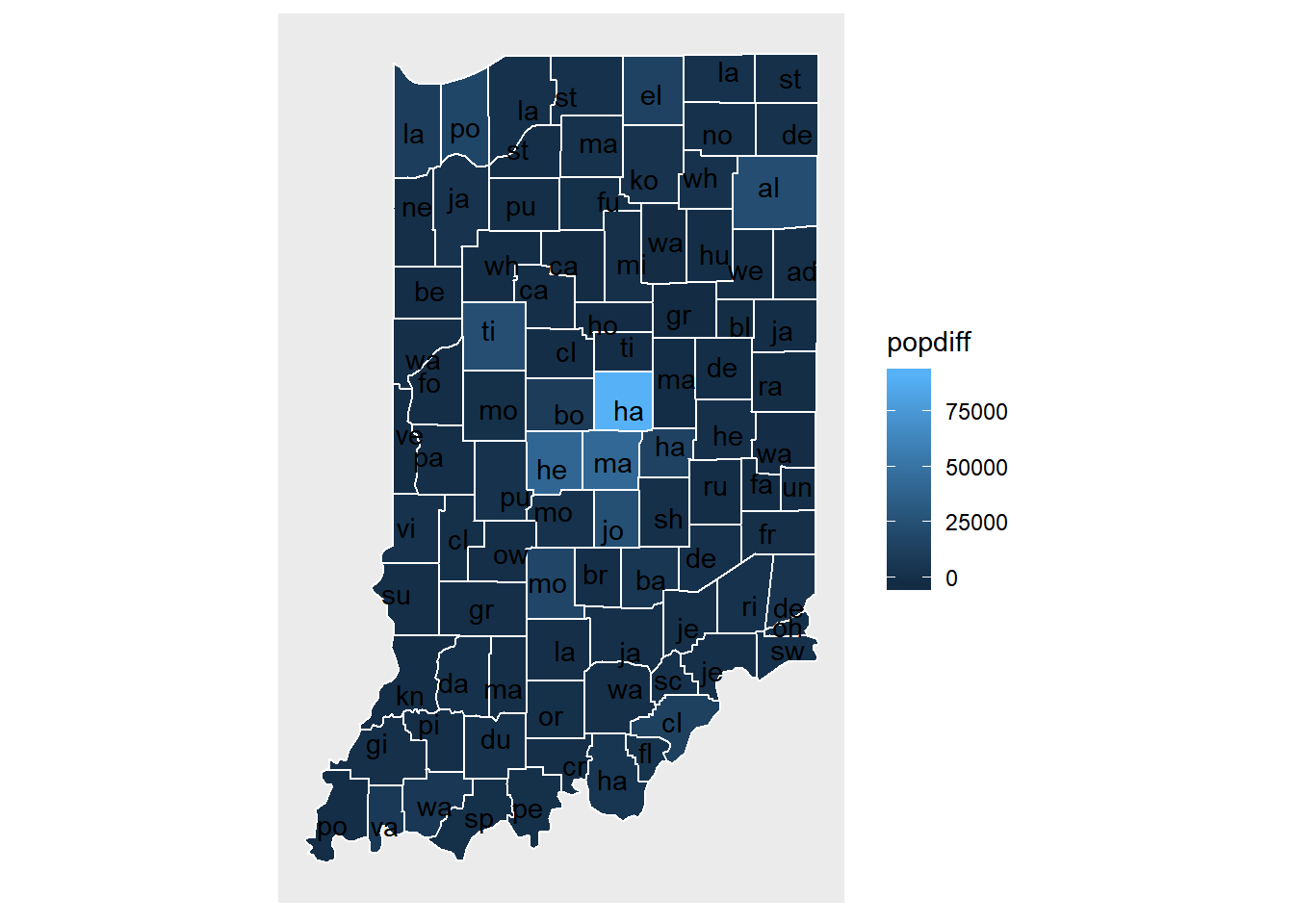
9.4.5.3 R package usmap
usa.mapdata <- us_map('states')
str(usa.mapdata)
## 'data.frame':    12999 obs. of  9 variables:
##  $ long : num  1091779 1091268 1091140 1090940 1090913 ...
##  $ lat  : num  -1380695 -1376372 -1362998 -1343517 -1341006 ...
##  $ order: int  1 2 3 4 5 6 7 8 9 10 ...
##  $ hole : logi  FALSE FALSE FALSE FALSE FALSE FALSE ...
##  $ piece: int  1 1 1 1 1 1 1 1 1 1 ...
##  $ group: chr  "01.1" "01.1" "01.1" "01.1" ...
##  $ fips : chr  "01" "01" "01" "01" ...
##  $ abbr : chr  "AL" "AL" "AL" "AL" ...
##  $ full : chr  "Alabama" "Alabama" "Alabama" "Alabama" ...

ggplot(data = usa.mapdata) +
  geom_polygon(aes(x = long, y = lat, fill = full, group = group), color = "white") +
guides(fill=FALSE) 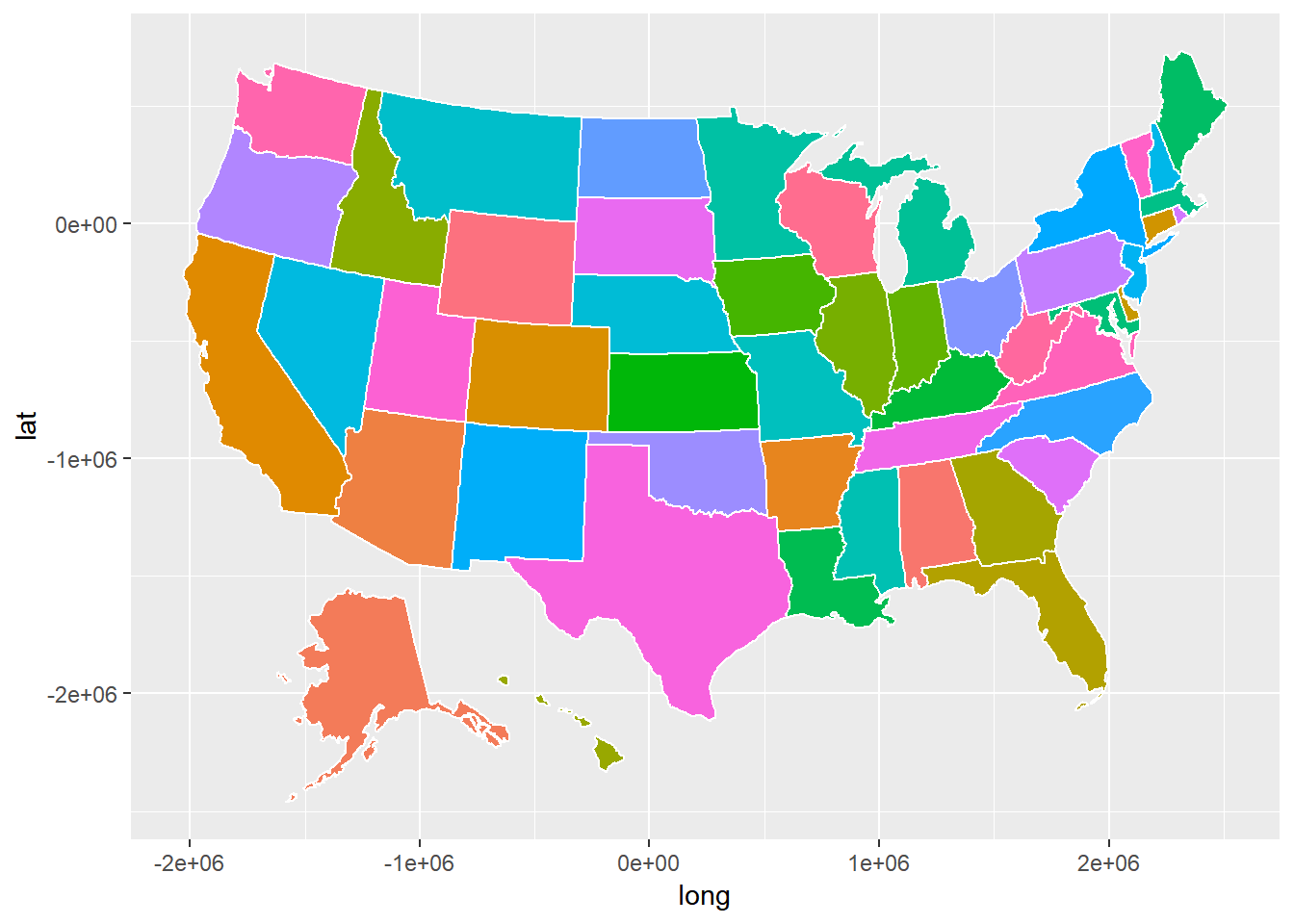
9.4.5.4 R package ggmap
ggmap is an R package that makes it easy to retrieve raster map tiles from popular online mapping services like Google Maps and Stamen Maps and plot them using the ggplot2 framework.
The function get_stamenmap can download a map tile from a tile server for Stamen Maps. It can be used for without any limitation but Stamen maps don’t cover the entire world. The use of the function get_stamenmap is to cut a tile from a world map based on latitude and longitude. We can specify the area using a vector with the left longitude, bottom latitude, right longitude, and top latitude. Different ways can be used to find such information.
- Use Google Maps
- On your computer, open Google Maps. If you’re using Maps in Lite mode, you’ll see a lightning bolt at the bottom and you won’t be able to get the coordinates of a place.
- Right-click the place or area on the map.
- Select What’s here?
- At the bottom, you’ll see a card with the coordinates.
- Use OpenStreetMap
- On your computer, open OpenStreetMap.
- Right-click the place or area on the map.
- Select Show address?
- The coordinates are on the left panel.
- You can also use “Export” tab to find the coordinate for an area.
For example, to get the area map around Notre Dame, we can use the following:
ND <- c(left = -86.29, bottom = 41.68, right = -86.19, top = 41.72)
NDdata <- get_stamenmap(ND, zoom=12)
str(NDdata)
##  'ggmap' chr [1:156, 1:290] "#DBDCD4" "#E5E6DE" "#E6E6E1" "#E5E6DE" ...
##  - attr(*, "bb")='data.frame':   1 obs. of  4 variables:
##   ..$ ll.lat: num 41.7
##   ..$ ll.lon: num -86.3
##   ..$ ur.lat: num 41.7
##   ..$ ur.lon: num -86.2
##  - attr(*, "source")= chr "stamen"
##  - attr(*, "maptype")= chr "terrain"
##  - attr(*, "zoom")= num 12

NDmap <- ggmap(NDdata)  ## zoom can be a number from 1 to 18 to specify the details of the map.
NDmap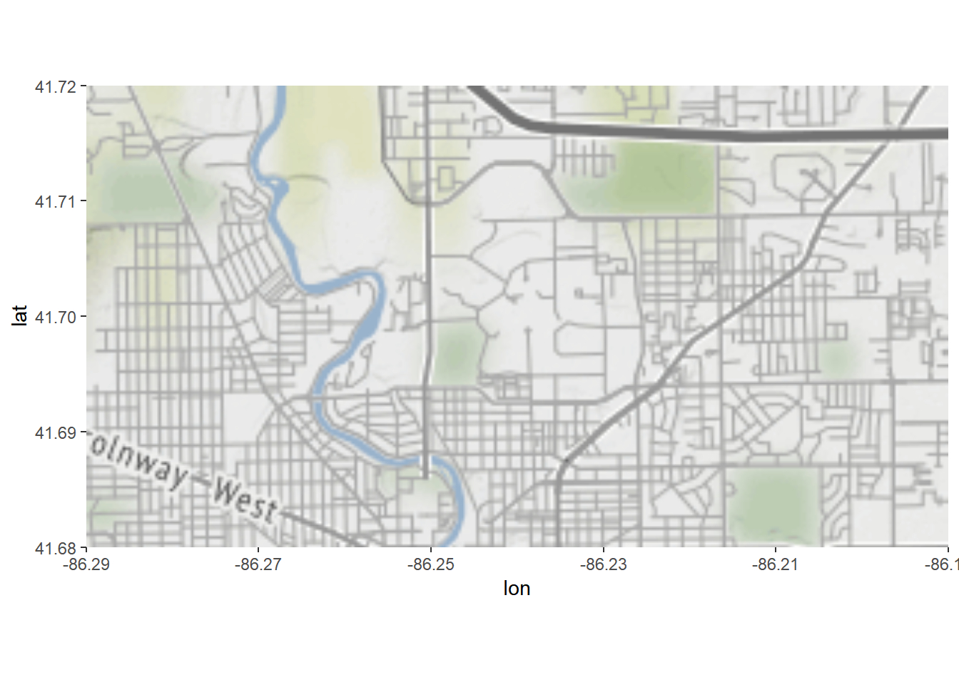
We can add the information to the map, too.
txt <- "
lat, long, place
41.698462, -86.233917, ND Stadium
41.698118, -86.232704, Corbett
41.704477, -86.237384, Haggar
"

nd.places <- read.csv(text = txt)

NDmap +
  geom_point(data=nd.places, aes(long, lat), color='blue') +
  geom_text(data=nd.places, aes(long, lat, label = place))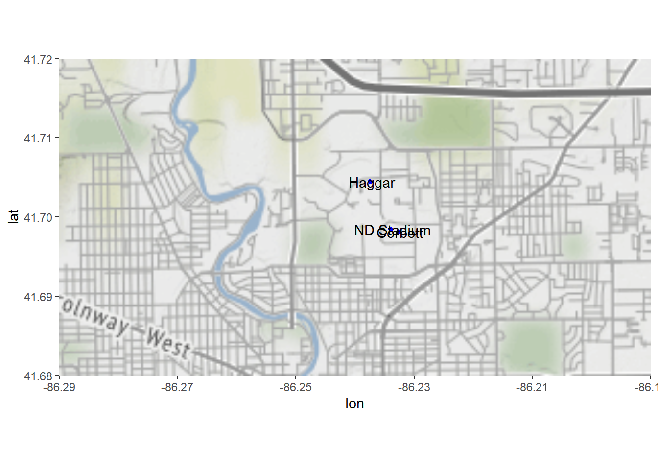
The following example is adapted from the help document of ggmap to visualize the crime data in Houston. First of all, the data crime include crime information from January 2010 to August 2010 geocoded with Google Maps. Note that qmplot provides a function for quick map visualization.
str(crime)
## 'data.frame':    86314 obs. of  17 variables:
##  $ time    : POSIXct, format: "2010-01-01 01:00:00" "2010-01-01 01:00:00" ...
##  $ date    : chr  "1/1/2010" "1/1/2010" "1/1/2010" "1/1/2010" ...
##  $ hour    : int  0 0 0 0 0 0 0 0 0 0 ...
##  $ premise : chr  "18A" "13R" "20R" "20R" ...
##  $ offense : Factor w/ 7 levels "aggravated assault",..: 4 6 1 1 1 3 3 3 3 3 ...
##  $ beat    : chr  "15E30" "13D10" "16E20" "2A30" ...
##  $ block   : chr  "9600-9699" "4700-4799" "5000-5099" "1000-1099" ...
##  $ street  : chr  "marlive" "telephone" "wickview" "ashland" ...
##  $ type    : chr  "ln" "rd" "ln" "st" ...
##  $ suffix  : chr  "-" "-" "-" "-" ...
##  $ number  : int  1 1 1 1 1 1 1 1 1 1 ...
##  $ month   : Ord.factor w/ 8 levels "january"<"february"<..: 1 1 1 1 1 1 1 1 1 1 ...
##  $ day     : Ord.factor w/ 7 levels "monday"<"tuesday"<..: 5 5 5 5 5 5 5 5 5 5 ...
##  $ location: chr  "apartment parking lot" "road / street / sidewalk" "residence / house" "residence / house" ...
##  $ address : chr  "9650 marlive ln" "4750 telephone rd" "5050 wickview ln" "1050 ashland st" ...
##  $ lon     : num  -95.4 -95.3 -95.5 -95.4 -95.4 ...
##  $ lat     : num  29.7 29.7 29.6 29.8 29.7 ...

crime.downtown <- crime %>%
  filter(
    -95.39681 <= lon & lon <= -95.34188,
     29.73631 <= lat & lat <=  29.78400
  )

qmplot(lon, lat, data = crime.downtown, maptype = "toner-lite", color = offense)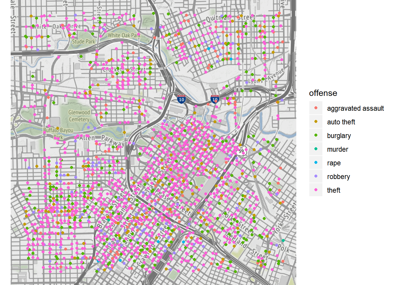
Since ggmap’s built on top of ggplot2, all ggplot2 method will work.
robberies <- crime.downtown %>% filter(offense == "robbery")

qmplot(lon, lat, data = robberies, geom = "blank",
  zoom = 14, maptype = "toner-background", darken = .7, legend = "topleft"
) +
  stat_density_2d(aes(fill = ..level..), geom = "polygon", alpha = .3, color = NA) +
  scale_fill_gradient2("Robbery\nPropensity", low = "white", mid = "yellow", high = "red", midpoint = 650)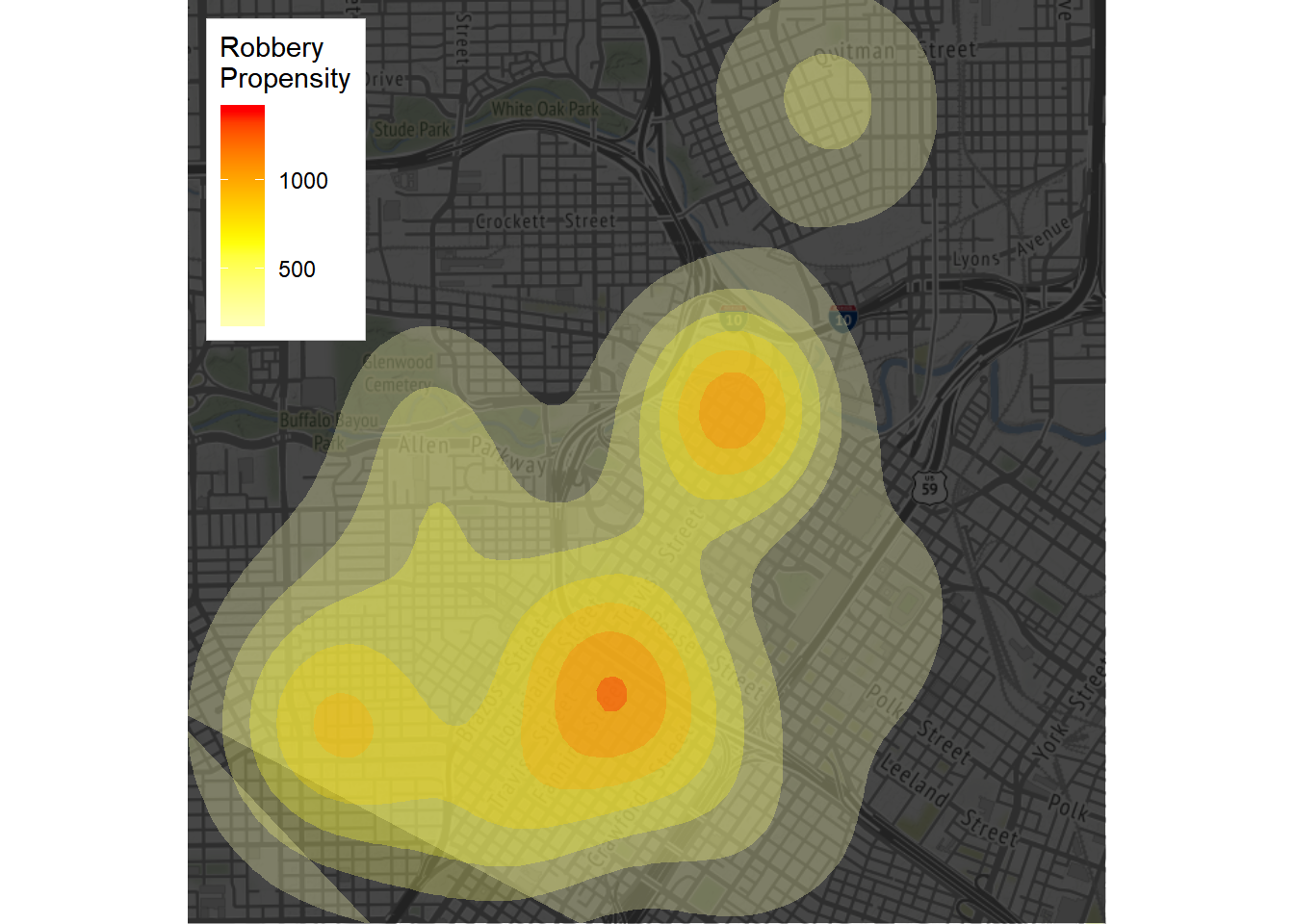
Faceting works, too:
qmplot(lon, lat, data = crime.downtown, maptype = "toner-background", color = offense) +
  facet_wrap(~ offense)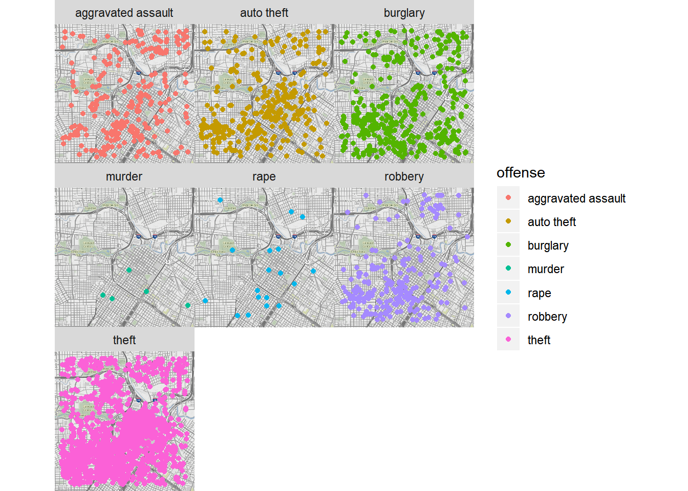
timeofday <- rep('Night', nrow(crime.downtown))
timeofday[crime.downtown$hour >= 6 & crime.downtown$hour <= 12] <- 'Morning'
timeofday[crime.downtown$hour >= 13 & crime.downtown$hour <= 20] <- 'Afternoon'

crime.downtown$timeofday <- timeofday

qmplot(lon, lat, data = crime.downtown, maptype = "toner-background", color = offense) +
  facet_wrap(~ timeofday)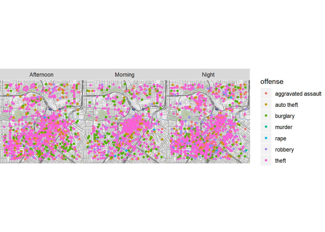
Google Maps can be used as well for map visualization. However, since Google Maps use a center/zoom specification, the input is a bit different. Instead of specifying a tile, we provide the center of the location and the zoom level. In addition, the name of the place can be used directly.
To use Google Maps, we need to get an API key first.
## Use the API key
api_key <- "AIzaSyBq6CMm6jW3XJN1ZAc5aoUm57oVnCXz1Mg"
register_google(key = api_key)

## download Google Maps data
## map zoom; an integer from 3 (continent) to 21 (building), default value 10 (city)
map.nd <- get_googlemap("Notre Dame, in 46556", zoom = 15, maptype = "satellite")
str(map.nd)
##  'ggmap' chr [1:1280, 1:1280] "#526049" "#526049" "#526049" "#59624C" ...
##  - attr(*, "source")= chr "google"
##  - attr(*, "maptype")= chr "satellite"
##  - attr(*, "zoom")= num 15
##  - attr(*, "bb")=Classes 'tbl_df', 'tbl' and 'data.frame':   1 obs. of  4 variables:
##   ..$ ll.lat: num 41.7
##   ..$ ll.lon: num -86.3
##   ..$ ur.lat: num 41.7
##   ..$ ur.lon: num -86.2

ggmap(map.nd) +
  geom_point(data=nd.places, aes(long, lat), color='blue')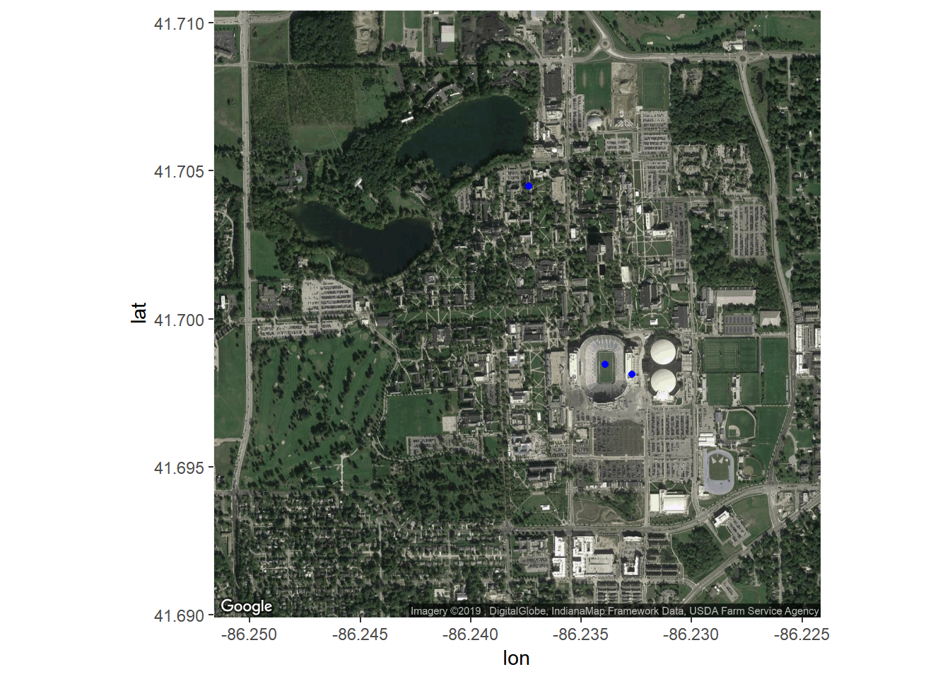
Different styles of Google Maps can be plotted, too.
get_googlemap("Notre Dame, in 46556", zoom = 12, maptype = "terrain") %>% ggmap()
get_googlemap("Notre Dame, in 46556", zoom = 12, maptype = "hybrid") %>% ggmap()
get_googlemap("Notre Dame, in 46556", zoom = 12, maptype = "roadmap") %>% ggmap()
Google’s geocoding and reverse geocoding API’s are available through geocode() and revgeocode(), respectively.
geocode("390 Corbett Family Hall, Notre Dame, IN 46556")
## # A tibble: 1 x 2
##     lon   lat
##   <dbl> <dbl>
## 1 -86.2  41.7
revgeocode(c(lon = -86.24188, lat = 41.69803))
## [1] "O'Neill Hall, Notre Dame, IN 46556, USA"
A very useful feature is to get the geocode of a location and mutate it with data through the function mutate_geocode(). For example,
tibble(address = c("Notre Dame, IN 46556", "Mishawaka, IN 46545", "Granger, IN 46530")) %>%
mutate_geocode(address)
## # A tibble: 3 x 3
## address lon lat
## <chr> <dbl> <dbl>
## 1 Notre Dame, IN 46556 -86.2 41.7
## 2 Mishawaka, IN 46545 -86.1 41.7
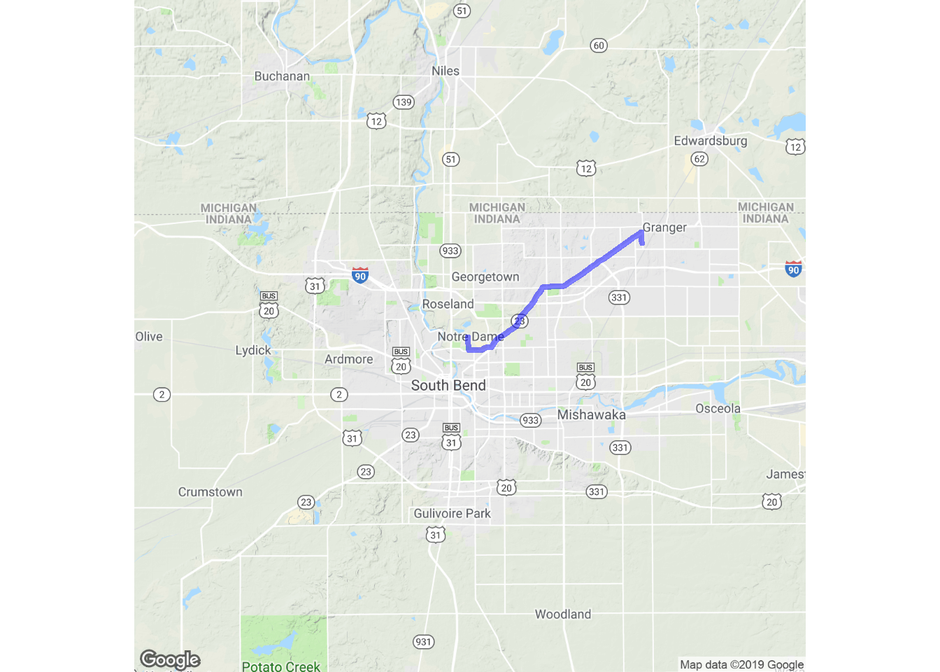
## 3 Granger, IN 46530 -86.1 41.7Treks use Google’s routing API to give you routes (route() and trek() give slightly different results; the latter hugs roads):
trek_df <- trek("Notre Dame, IN 46556", "Granger, IN 46530")

qmap("Notre Dame, IN 46556", zoom = 11) +
  geom_path(
    aes(x = lon, y = lat),  colour = "blue",
    size = 1.5, alpha = .5,
    data = trek_df, lineend = "round"
  )
Map distances, in both length and anticipated time, can be computed with mapdist()). Moreover the function is vectorized:
mapdist(c("houston, texas", "dallas"), "waco, texas")
## # A tibble: 2 x 9
##   from           to               m    km miles seconds minutes hours mode
##   <chr>          <chr>        <int> <dbl> <dbl>   <int>   <dbl> <dbl> <chr>
## 1 houston, texas waco, texas 298227  298. 185.    10270   171.   2.85 driving
## 2 dallas         waco, texas 152480  152.  94.8    5375    89.6  1.49 driving